
The Kendo UI Forms Guide

The Kendo UI for Angular team created a forms guide to not only be the hippest kids on the block, but to also help developers with something that is so common and yet often could be done better. Our forms guidance comes from years of creating forms, working with partners on their forms, and always struggling to meet all accessible and SEO needs that arise in such an area.
Our forms guide covers a wide range of topics, from how to structure a horizontal form with labels inline instead of the default stacked one, how to separate form components into logical chunks, the best way to handle hint and validation messages, displaying content in a form based on the state of a form element and so much more. We gathered all this information to help you create the best possible Angular forms possible, even if you're not using Kendo UI for Angular. I’ll dive into a few of the juiciest 💦 pieces of advice in this article. Be sure to check out the full Forms Guide to see our full list of advice when it comes to semantic and well behaved forms!
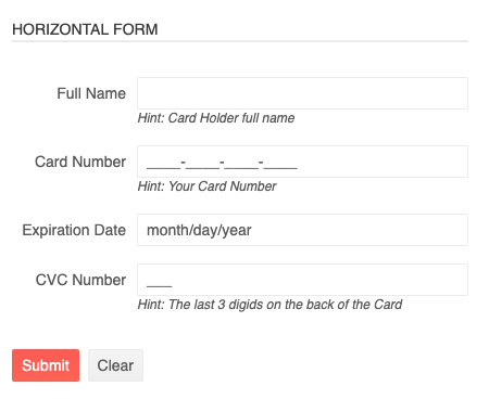
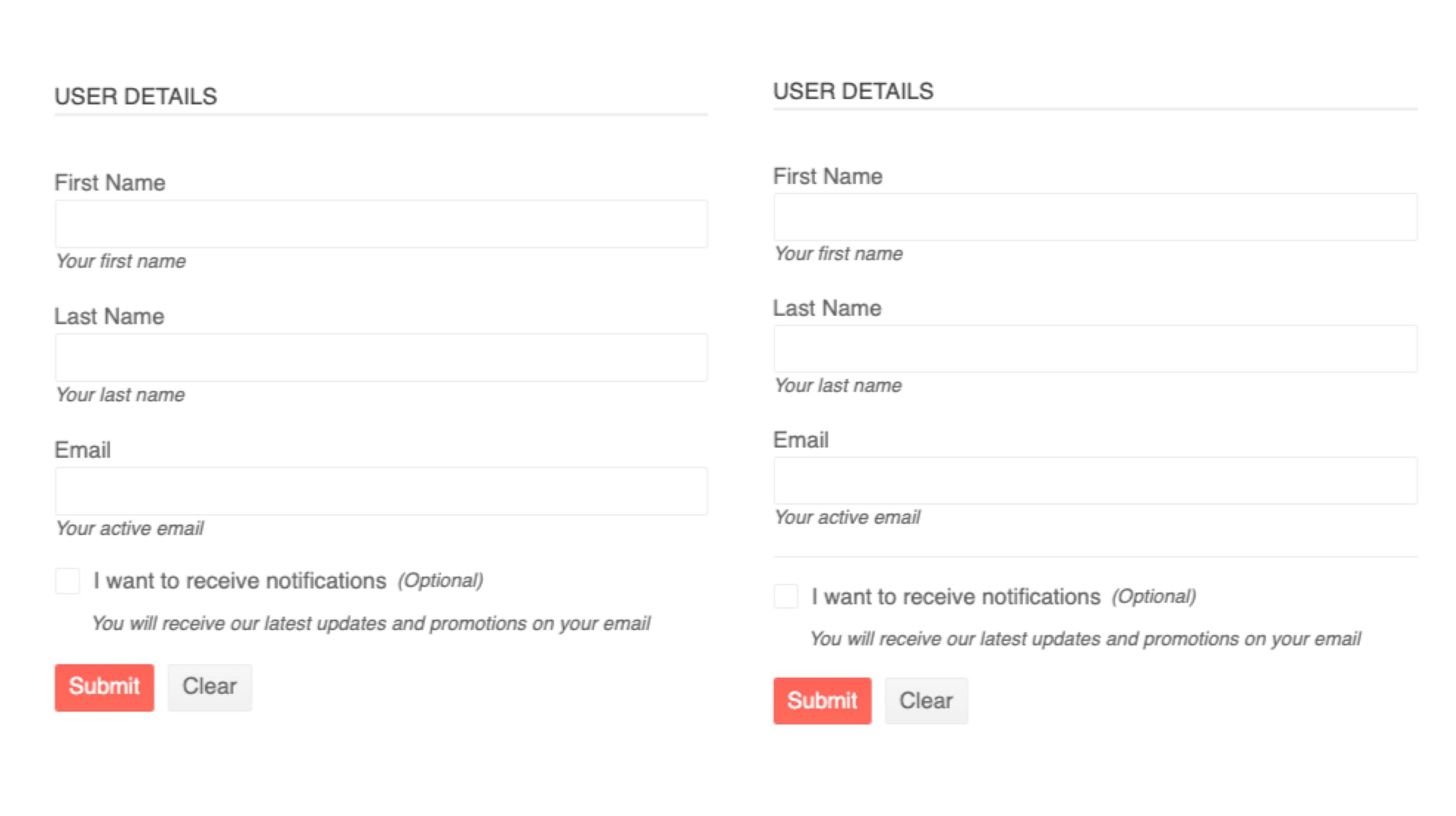
“Horizontal form layout” → aka Inline Labels
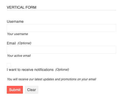
A common way to create forms and display labels is vertically, like the form below. This is created by having the labels and inputs be block level and full width, so they all stack nicely in a column. (This is default, btw, with Kendo UI form components inside a parent kendo-formfield.)
However, it is a simple matter to have side-by-side or inline labels for a “Horizontal Layout”:
- assign the
k-form-horizontalclass to theformelement - set the
orientationproperty of the FormField tohorizontal
Check out the differences here in this StackBlitz.
Accessibility & Semantic Win with Grouping Form Controls
A good tip to remember for SEO and accessibility wins is to group your form controls logically and surround groups with legend and fieldset elements.
A legend is a way to create a label for a group of content (the fieldset).
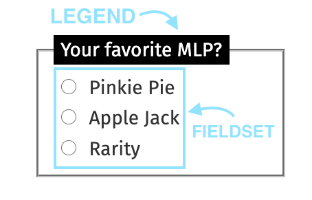
Sometimes it can be hard to know when we should use elements like this in our forms. The accessibility blog for Gov.UK advises to use them whenever you have multiple questions relating to the same topic or a multiple choice question with radio buttons that need to be grouped together under one legend.
When used correctly, the fieldset and legend elements tie related form fields together in a way that is accessible to people who cannot see the visual layout of the form. — Gov.UK
SEO and Accessibility are two items that people do not always think about for Forms, but one solution to furthering your form towards a more being more accessible is utilizing these two elements.
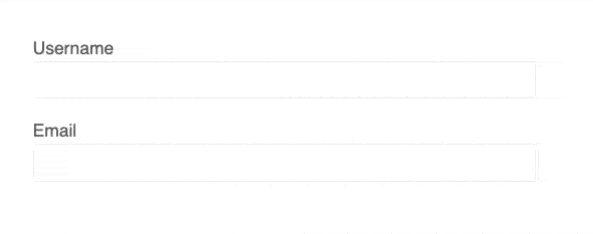
Separating Form Controls with Line Breaks
Another super simple and under-used solution for chunking forms is the line break!
Separators add a line break to the layout and improve the form conversion rate. The separation of sections allows you to make long forms easier to handle. To add a separator, add the
k-form-separatorclass on aspanelement.
Just look at how such a small thing can really elevate a form:
It’s such a small thing but it can really help break up content and set a smoother flow for the user. Using Kendo UI, it is as simple as adding a k-form-separator!
Form Validation & Error Messages
Error Indicators — Something is Wrong with Your Input
Another issue our forms guide gets into is form validation. It’s important to give feedback to users when they’re walking through a form. Not just the color indicators of the form-field or the error messages are important, but also the timing of the error. It’s best to have the errors only show up after the field has been touched or edited (dirty).
It’s important to not only have validation on your forms, but have it occur at the right time. Right after the user has improperly filled something out is the time to alert them, not when the form is being submitted.
Kendo UI’s FormField component enables you to control when and how validation messages will be shown, easily, in compliance with the Angular form validation guide. Check out more on the FormField component in our docs for more details.
Along with the accessibility guidelines, logical form chunking and form validation, our forms guide also outlines many of our commonly used form elements and how to construct them together properly in an Angular form. Check it out for all your form needs: Forms Guide.
As always, we love love love feedback here on the Kendo UI team! Please let us know if this demo app was useful to you and what kind of other demo apps you’d like to see!

Kendo UI for Angular Feedback Portal
Alyssa is the Angular Developer Advocate for Kendo UI. If you're into Angular, React, Vue or jQuery and also happen to love beautiful and highly detailed components, check out Kendo UI. You can find the Kendo UI for Angular library here or just jump into a free 30 day trial today. Happy Coding!

Alyssa Nicoll
Alyssa is an Angular Developer Advocate & GDE. Her two degrees (Web Design & Development and Psychology) feed her speaking career. She has spoken at over 30 conferences internationally, specializing in motivational soft talks, enjoys gaming on Xbox and scuba diving in her spare time. Her DM is always open, come talk sometime.
Related Posts
Comments
All articles
Topics
Latest Stories
in Your Inbox
Subscribe to be the first to get our expert-written articles and tutorials for developers!
All fields are required