
Storybook 8
Next level testing, performance, and compatibility

Storybook is the industry standard UI tool for building, testing, and documenting components and pages. It’s used by thousands of teams globally, integrates with all major JavaScript frameworks, and combines with most leading design and developer tools.
Today, I’m thrilled to announce the release of Storybook 8! This latest version of Storybook brings together 8,865 commits across 773 PRs from 218 contributors. These changes include major improvements to Storybook’s testing and documentation feature sets while strengthening framework compatibility and user experience across React, Vue, Angular, web-components, Svelte, and more. Read on to discover the release’s highlights, including:
📸 Built-in visual testing
⚛️ React Server Component support
🎛️ Upgraded Vue and React control autogeneration
⚡️ Rearchitected Vite support, Vitest testing, and Vite 5 support
🧪 2-4x faster test builds
✨ Refreshed desktop UI
📲 Rebuilt mobile UX
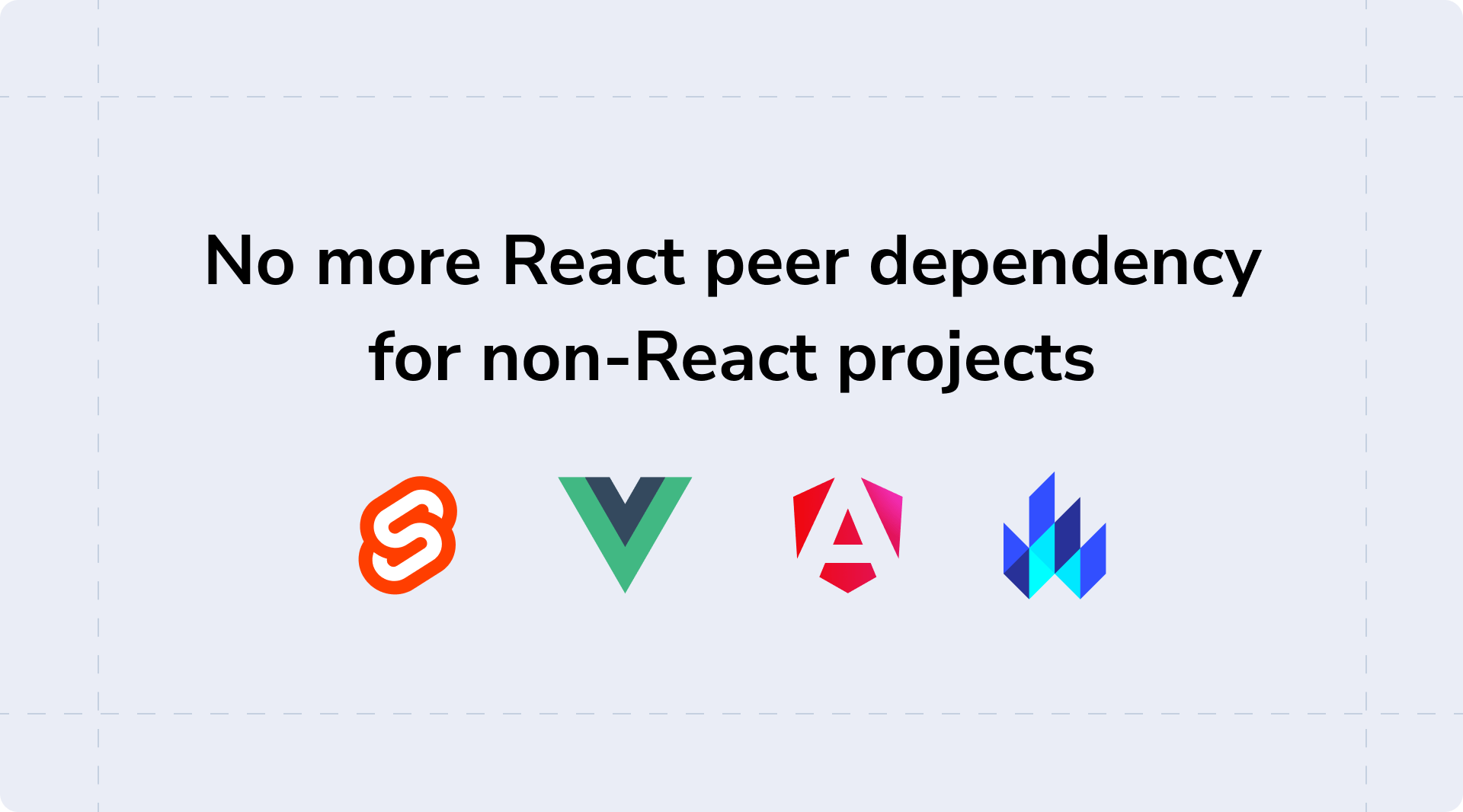
🙅♀️ Removed React dependency for non-React projects
Built-in visual testing
Storybook 8’s headline feature is the new Visual Tests addon, which lets you catch UI bugs faster and more easily than ever before. The addon brings Chromatic, the visual testing cloud service developed by Storybook maintainers, into Storybook for the very first time.
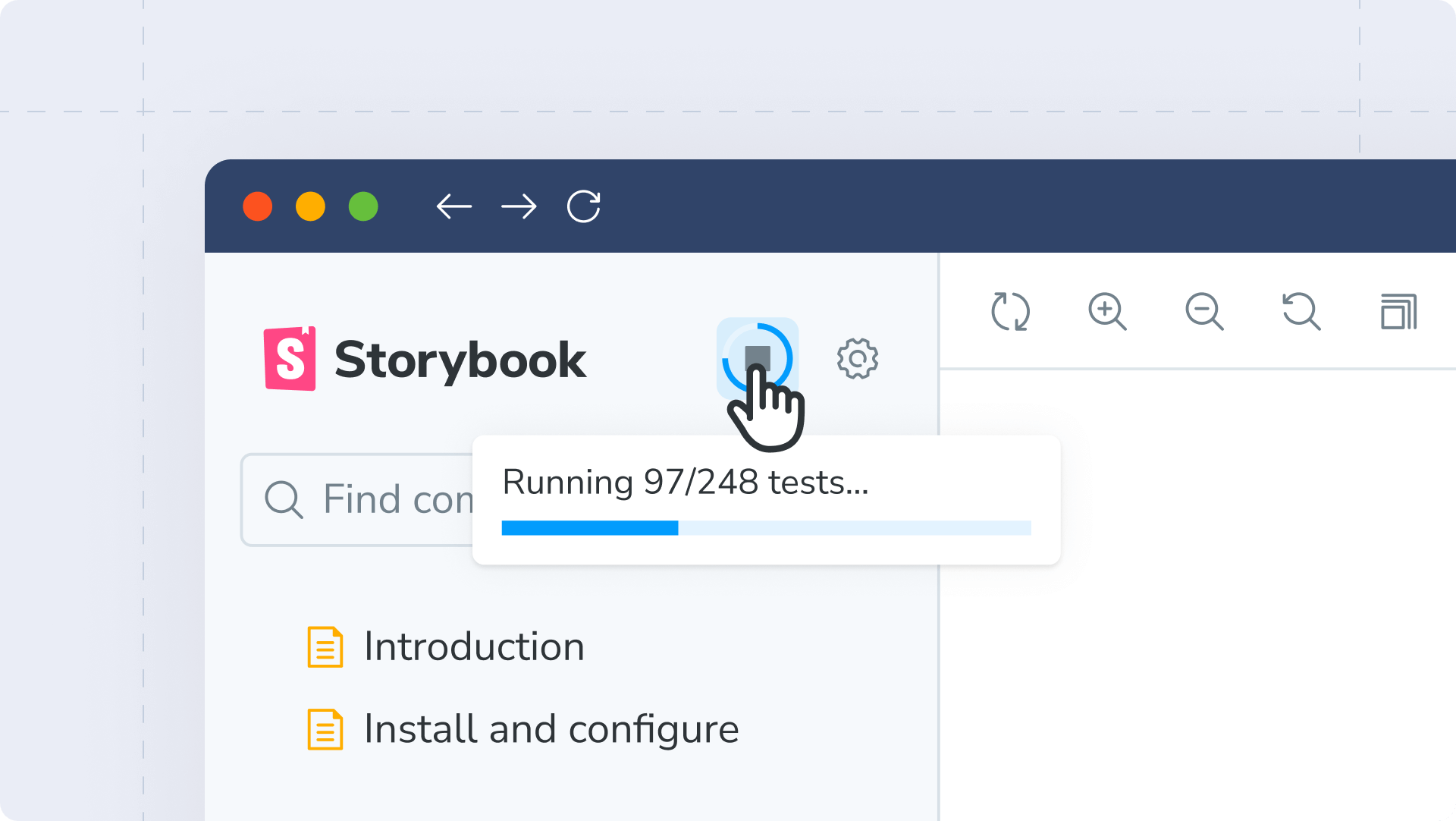
At the click of a button, you can test all your stories simultaneously, compare each one to previous versions, and pinpoint any visual changes. Then, filter your Storybook sidebar to only see stories containing visual differences and verify those changes one by one.
This process mirrors Chromatic’s CI workflow, but now it’s possible to do it all directly inside Storybook as you’re working, without needing to submit a PR or even commit your changes!
Visual testing is a superpower, and Visual Tests addon makes it more accessible than ever before.
Learn more about getting started with Visual Tests addon, or read the addon’s launch announcement.
React Server Component (RSC) support
React Server Components are a paradigm shift for React, where components are exclusively rendered on the server. We’ve been closely following the React core team’s explorations of RSC, as well as our friends at Next.js leading the charge in RSC app development.
Since Storybook 7’s release, we’ve received many questions about when Storybook’s RSC support would arrive. In fact, it’s one of our most popular GitHub issues.
Storybook 8 heeds your call and introduces our first-ever experimental support for React Server Components. We’re classifying our RSC solution as experimental because it’s compatible only with Next.js – for now. We’ll continue building this functionality through future releases.

To learn more about Storybook 8’s experimental RSC support, see how to build an RSC app with Next.js, Mock Service Worker, and Storybook 8. We plan to share more as we refine the best practices.
Improved React and Vue control autogeneration
One of Storybook’s signature features is auto-generated UI controls that let you modify component inputs interactively to explore new component states.
For React and Vue projects, Storybook 8 introduces major improvements to controls autogeneration, by upgrading the libraries we use to analyze your components (also known as “docgen”).
For React users, Storybook 8 switches to a significantly faster docgen library: react-docgen. Unlike our current TypeScript-based solution, react-docgen produces a shallower analysis that is way faster and good enough for virtually all components. In our tests, using react-docgen clocked up to 50% faster React Storybook startup times. The full TypeScript solution is still available as a fallback for anyone who needs it. Learn more in our React docgen documentation.
For Vue users, Storybook 8 brings support for an official Vue docgen package: vue-component-meta. This package is powered by Volar, which you may recognize as the official Vue VSCode plugin. Upgrading to vue-component-meta improves Storybook’s handling of types and our ability to autogenerate controls. Learn more about Storybook 8’s Vue changes in our Vue docgen announcement or our Vue docgen documentation.
Rearchitected Vite support, a Vitest-powered testing framework, and Vite 5 compatibility
One of Storybook 7’s biggest wins was the introduction of Storybook’s zero-config Vite support.
Since then, Vite usage has continued to skyrocket. Today, Vite accounts for nearly half of all new Storybook projects. Accordingly, we’ve continued to tighten and refine our Vite integration.
Firstly, Storybook 8 adds support for Vite 5, Vite’s latest and greatest. As we introduced Vite 5 support, we realized that Storybook was configuring too much on your behalf, which made it difficult for us to support different Vite versions. So, Storybook 8 gives you more control for configuring Vite plugins like plugin-react, plugin-vue, while moving those dependencies outside Storybook. Nearly all Vite projects come with these plugins pre-configured – so unless you’re doing something non-standard, it will require no changes on your part!
Storybook 8 also integrates Vite’s testing package, Vitest, as part of our new framework: @storybook/test. This new testing framework replaces two previous packages (@storybook/jest and @storybook/testing-library), enables the use of Vitest’s spy and expect, and has a smaller installation footprint. Learn more about Storybook 8’s testing improvements.
2-4x faster test builds
Storybook 8 introduces a new “test mode” that makes static builds of Storybook 2-4 times faster.
We observed that when you build Storybook for use with testing tool like Storybook’s Test Runner or Chromatic, you might not require Storybook features like documentation or auto-generated controls.
As such, Storybook 8 enables a streamlined test workflow by providing a new --test CLI flag that disables a variety of Storybook’s standard features. Using this flag gives you dramatically faster build times and smaller build outputs. We’ll continue to explore new optimization possibilities in every future release!
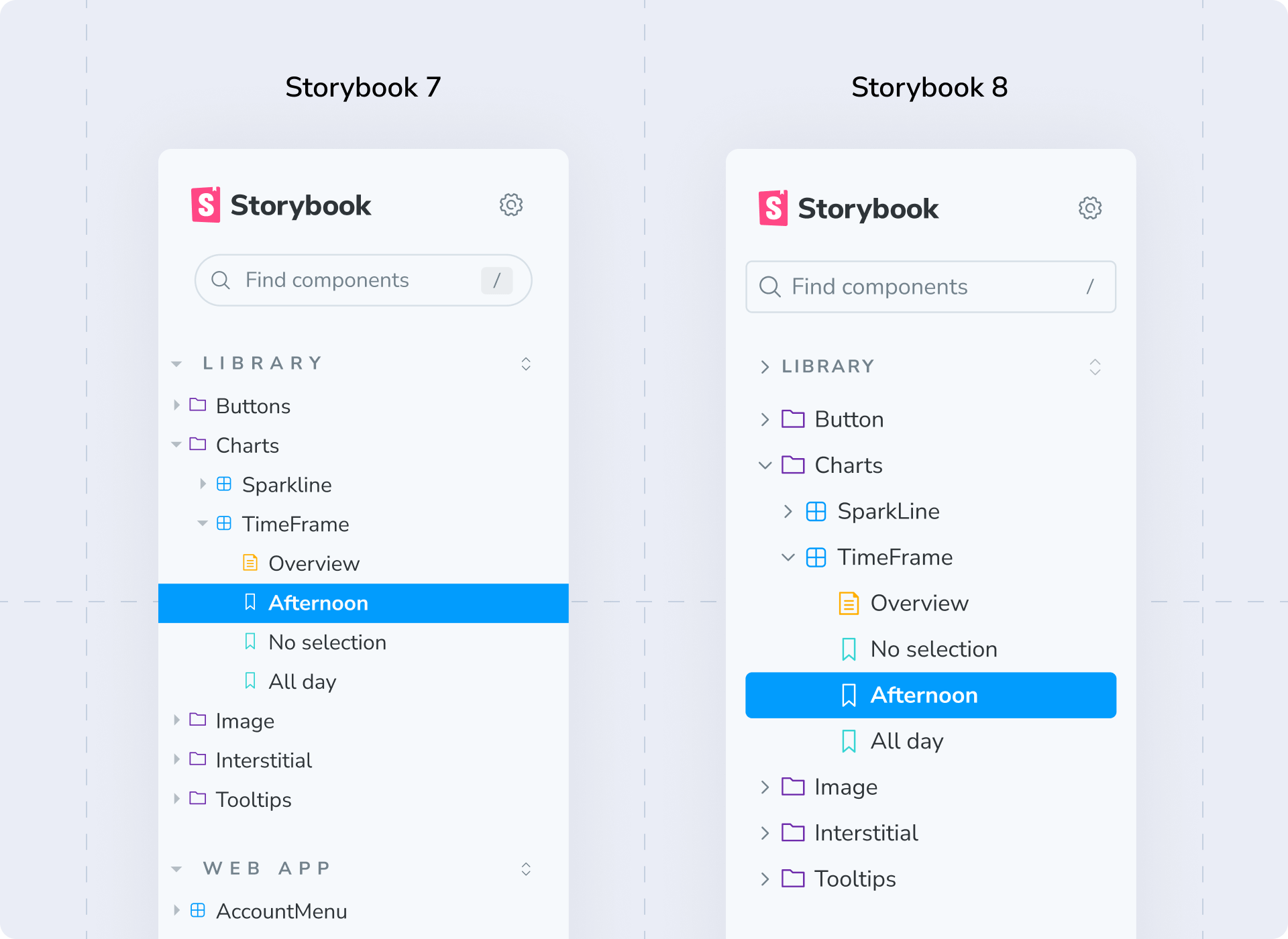
Updated mobile and desktop UI
Storybook 8’s UI brings a bunch of refinements and polish, and if you have an eye for design we think you’ll love these changes.
We overhauled Storybook’s mobile UI completely. Now, both the navigation sidebar and addon panel spring up from the bottom of the page, making them easy to trigger with your thumb on a phone. Unlike the previous version, these panels co-exist elegantly with the main “Canvas” area of Storybook.
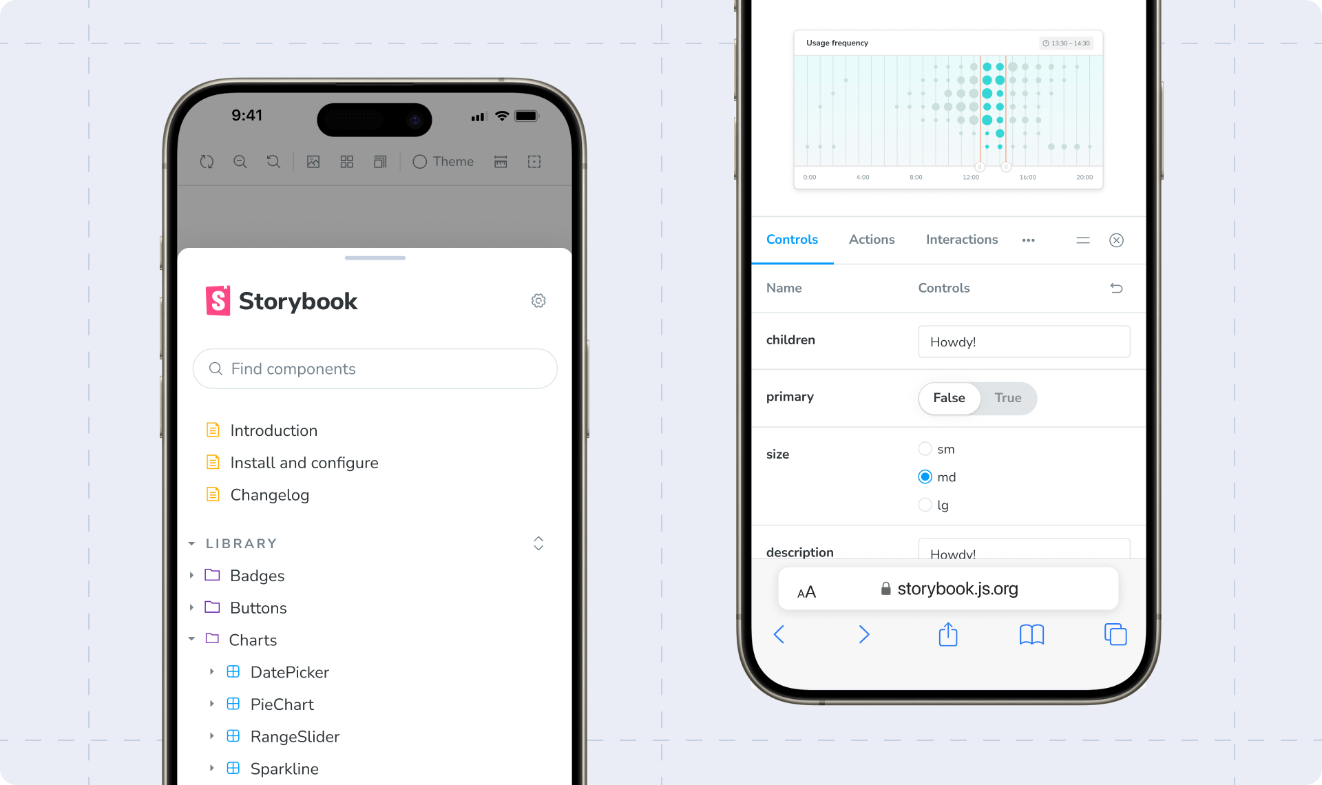
We also rearchitected the desktop UI to fix a long-standing responsiveness bug, where stories remounted when the browser resized between desktop and mobile states. In Storybook 8, that transition is buttery smooth and absolutely delicious, sprinkled with a topping of updated typography and a new icon set.
No more React requirement in non-React projects
In Storybook 7, we made the hard decision to make React a peer dependency for all framework projects. While this change made Storybook compatible with pnpm and other modern package managers, it was a bitter pill to swallow for non-React users.
Thankfully, we’ve learned a lot since then about dependency wrangling and package prebundling (thanks tsup!) so that Storybook 8 now removes the React peer dependency for non-React Storybooks. Storybook’s UI is still written in React, but you can kiss those react and react-dom dependencies in your package.json goodbye!
Framework-specific improvements
Thanks to the last year’s worth of maintenance from an expanded core team, Storybook is faster, more compatible, and more stable than ever. Here are the highlights!
React: React gets experimental React Server Component support and react-docgen as a faster default for auto-generating interactive controls, both described above.
Vue: Vue gets Volar-powered auto-generated controls that support the latest Vue features and TypeScript types. It also gets dynamic source snippets in docs and numerous bugfixes from our new maintainers, Chakir and Lars.
Angular: Angular gets Angular 16/17 support, nested module metadata, standalone directives, easier-to-write stories, and dozens of bugfixes. We’re also working with the Angular core team to support new high-performance build options in a future version.
Web Components: Storybook’s Web Component stories are written in Lit and we’ve updated to support Lit3. Additionally we’ve fixed issues related to auto-generated controls and dynamically-generated source snippets.
Svelte: Storybook’s Svelte support has gotten a ton of love from the Storybook core team, the Svelte core team, and the community at large. Key improvements include Svelte 5 (prerelease) support, SvelteKit page and navigation mocking, and key fixes/improvements to Storybook’s “native” Svelte story format.
Get started
To make a fresh install of Storybook 8, run:
npx storybook@latest initTo upgrade an existing Storybook to Storybook 8, run:
npx storybook@latest upgradeFor help with upgrading, consult our Storybook 8 migration guides to learn how to upgrade from Storybook 7 to Storybook 8, or how to upgrade from Storybook 6 to Storybook 8. Alternatively, refer to our extended Storybook migration guide on GitHub.
Celebrate Storybook 8 🥳
Between Storybook 7 and Storybook 8, Storybook won the GitHub 2023 Global Grandiose award for our worldwide community! In that same spirit, we’re running two meetups on March 28 where you can celebrate the Storybook 8 launch with your local frontend scene. Join us in Paris or join us in New York!
Additionally, thank you to all our community launch partners across the frontend ecosystem for helping us bring Storybook 8 to the world! Thanks to Chromatic, Figma, ViteConf, Omlet, DivRiots, story.to.design, StackBlitz, UXpin, Nx, Mock Service Worker, Anima, Zeplin, zeroheight, Storyblok, kickstartDS, and Kendo UI.
Credits
Core team
Michael Arestad, Yann Braga, João Cardoso, Michael Chan, Tom Coleman, Charles de Dreuille, Norbert de Langen, Shaun Evening, Kyle Gach, Gert Hengeveld, Dom Nguyen, Valentin Palkovic, Kasper Peulen, Chakir Qatab, Jeppe Reinhold, Lars Rickert, Kai Röder, Michael Shilman (me!), Joe Vaughan, Varun Vachhar, Ian Van Schooten, Daniel Williams, Josh Wooding, and Vanessa Yuen
Contributors
@0916dhkim, @1234tgk, @43081j, @aditya1, @adityakrmodak, @agriffis, @ai, @alitas, @almoghaimo, @amerlander, @andarist, @anneau, @artur93gev, @arunoda, @arup1221, @atreay, @auctumnus, @bashmish, @bdriguesdev, @benmccann, @bkfarnsworth, @bodograumann, @bryanjtc, @cdedreuille, @cgatian, @chakas3, @chocoscoding, @coliff, @cprecioso, @danez, @danielmarcano, @dannyhw, @dartess, @darth-koder007, @daves28, @decherneyge, @devanandb, @devazc, @diamondex, @domyen, @dotwoodmedia, @dprcoles, @drik98, @dschungelabenteuer, @dubbs, @edutoit, @efrenaragon96, @epreston, @felixrizzolli, @fezvrasta, @filiptammergard, @flambe, @francois2metz, @g-cappai, @githrdw, @gitstart, @gossi, @greut, @gufah, @halitiince, @hcvdhaar, @henkerik, @hobbes7878, @hoishin, @honzahruby, @iabu94, @ianvs, @idesigncode, @iqbalcodes6602, @irangarcia, @ivoilic, @j3rem1e, @jackw, @jared-christensen, @joaonunomota, @joekarow, @joevaugh4n, @joeycozza, @johnhunter, @jonniebigodes, @jonthenerd, @joriswitteman, @joshbolduc, @jpzwarte, @jreinhold, @json-betsec, @julien-deramond, @junghoe, @kaelig, @karolstawowski, @kasperpeulen, @kawokas, @kbazilio, @kkirby, @klescouar, @kolife01, @kota-kamikawa, @kripod, @kshmidt-digma, @ksugawara61, @kubijo, @kuriacka, @kylegach, @kylemeenehan, @kyletsang, @larsrickert, @legnaleurc, @leniwen, @literalpie, @lucavazz, @luk-z, @machycek, @maheshchandra10, @manbearwiz, @mandarini, @mariasimo, @mariocadenas, @marklb, @martinnabhan, @masaya48, @mastrzyz, @mattlewis92, @mauriciorobayo, @mdornseif, @medihack, @mh-ahs, @michens, @mickmcgrath13, @miily8310s, @mlazari, @mrzillagold, @mvarendorff, @naporin0624, @nasvillanueva, @natehouk, @ndelangen, @nikospapcom, @nilsjacobsen, @nkabrown, @nlepage, @notwoods, @noviceguru, @nsheaps, @nvitius, @omahs, @orangecms, @oruman, @osnoser1, @paoloricciuti, @pascalfiv, @piratetaco, @pruthvip15, @pure-js, @rashidshamloo, @re-taro, @redbugz, @reyronald, @roel-t, @rohanpoojary1107, @roottool, @rwaight, @samvv, @seriouz, @shaunevening, @sheriffmoose, @shilman, @showrin, @sidnioulz, @sitogi, @sjwilczynski, @smeagol74, @sookmax, @specialdoom, @speelbarrow, @spookyjelly, @stegano, @stilt0n, @stof, @stropitek, @subhajit20, @syabro, @t99, @taehyeon-envoi, @taozhou-glean, @tap-kim, @thapasusheel, @thisisanto, @thtliife, @tmeasday, @tolkadot, @tomo5524, @tsvanharen, @turtle601, @tusharwebd, @ubugnu, @unional, @usrrname, @valentinpalkovic, @vanessayuenn, @vmizg, @webblocksapp, @wesgro, @wilson2k, @wise-introvert, @wjdtjdgns, @wouterk12, @wuzhuobin, @xueyawei, @xyy94813, @yannbf, @ygkn, @yilun-sun, @yoshi2no, @yossisaadi, @youngboy, @zachtball, and @zmarkan
Storybook 8 is here! 🥳
— Storybook (@storybookjs) March 12, 2024
📸 Visual Tests addon
⚛️ React Server Component support
🎛️ Upgraded Vue & React control autogeneration
⚡️ Rearchitected @vite_js support + Vite 5
✨ New UI on desktop and mobile
💯 8,865 commits, 773 PRs, 218 contributorshttps://t.co/AwAUPzeV18 pic.twitter.com/L8ufLbfeww