logo ideas #37
Comments
|
greate job |
|
I can't wait to stick that hard drive on my laptop lid. |
|
Maybe something more simple? I love @substack 's proposal but don't know if it will be easy to stamp on tshirts and that kind of stuff logos are mostly used for. |

|
+1 for @zeke |
|
During my lunch break. |

|
+1 for @karlbright, nice job! |
|
I'm with @substack. Octagon O, binary, 10, etc. Probably needs the full "js" as a kicker, but that's for later. svg under public domain "license". |

|
sticker pack: licence: public domain or CC0 at your choice |

|
@substack these are really cool. nice work! |
|
@zeke does it also come in JavaScript yellow? |
|
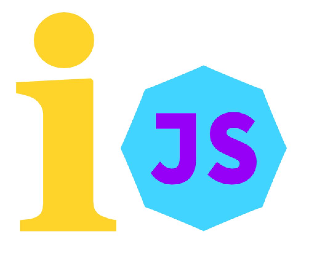
"I" and an octagonal "O" in the z axis.
|

|
@substack It's 2014 now can't we at least have SSD for the log? :P |
|
a kind of silly 4-color: |

|
also, some jupiter transit: (based on I think @substack's is my favorite thus far, though :) |


|
@substack beautiful. |
|
@karlbright's one is my favorite so far, with a small change the yellow circle made to octagon |
|
@kylebright nice idea, but I'd switch the arrow direction, as currently it's accidentally symbolising backwards (anti-clockwise) movement, which as a forward thinking project it is symbolising the opposite of what we desire to do. @zeke wasn't that logo style used by google I/O conference at some point? On @SubStacks' design? It'll become illegible at smaller resolutions and printing will likely bleed. Also if seen in grey-scale it'll loose clarity. Similar on @chrisdickinson's Jupiter design, although I do love that rusty red color. Given all my words here, I'll work on a few concepts when I get a moment. |
|
As a bystander:
The octagon is IMHO fantastic. It has always been the symbol for rational thought, and I love it. But it’s not stackable as an hexagon is. So we’re losing some points on the ‘scalability’ concept there. @substack colors are fantastic, but work only on figurative designs. |
|
@kt3k By the way, I personally don‘t like the idea of JS-ers to be ninjas. Quick, dirty and criminal. (I love ninjas anyway). If we have to go criminal let’s go pirate :) |
|
And a last note, the harddrive in @substack idea is perfectly executed but lacks of comunicative energy. Is |
|
Got to spend a little more time at having another crack with some ideas before leaving work. Someone can polish these up if they say any potential, it definitely needs more time. Idea being the octagon for V8 as @substack mentioned. Then the right hand side being the node colour and looking like an arrow forward before forming an I as the colours transition. This can work in B&W as well with some work and seperation between some elements. The "ribbons" were kind of meant as a way to show I/O without throwing arrows around.
license: public domain / CC0 |


|
@karlbright +1 (I really like the 2nd one) |
|
@karlbright very much looks like "no" rather than "i/o" |
|
@phpnode haha perfect! |
|
@phpnode I agree, needs some work. perhaps the I is formed from the bottom, or not joined at all. Throw around some ideas. |
|
i'm doing loads of online 3D stuff these days so i did this mock-up..
here is the live demo & GLSL code
[edit]
[/edit] |


|
I like @zeke's the best so far. We should try to avoid anything cartoony. Node/io.js is simple and low level but very powerful which is why I would want a simple, elegant logo. The only issue with @zeke's is that it is not unique/easily identifiable. Perhaps a variation of this with a couple tweaks to make it unique. |
|
@zeke's is really great but doesn't it bear too much resemblance to Node's logo style with the hexagons? 👍 @karlbright, shadows on the second one are great - the style in general works well as it can easily be flattened and look good as a silhouette. Let's not forget the importance of how the logo will look when it's desaturated/flat/turned into a decal. |
Let's all make some logos!
I'll go first:
svg file
license: public domain / CC0
Some other ideas:
The text was updated successfully, but these errors were encountered: