In this tutorial, I’ll introduce you to Material Design in Angular, then we’ll look at how to create a simple Angular application with a UI built from various Angular Material components.
The widespread adoption of component-based frameworks such as Angular, React and Vue.js has seen a growing number of pre-built UI component collections become available. Using such collections can help developers to quickly create professional-looking applications.
What’s Material Design?
Material Design (codenamed Quantum Paper) is a visual language that can be used to create digital experiences. It’s a set of principles and guidelines across platforms and devices for interactivity, motion and components that simplify the design workflow for teams designing their product.
The Material components allow you to create professional UIs with powerful modularity, theming and customization features.
Introduction to Angular Material
Angular Material is the implementation of Material Design principles and guidelines for Angular. It contains various UI components, such as:
- form controls (input, select, checkbox, date picker and sliders etc.),
- navigation patterns (menus, sidenav and toolbar)
- layout components (grids, cards, tabs and lists )
- buttons
- indicators (progress bars and spinners)
- popups and modals
- data tables with headers and pagination etc.
Requirements
Before you can continue with this tutorial, you need to make sure you have a development machine with Node (6.9.0+) and NPM (3+) installed.
You also need to have the Angular CLI installed. If that’s not the case, simply run the following command in your terminal or command prompt:
npm install -g @angular/cli
Create the Project with the Angular CLI
Let’s now create the Angular project using the Angular CLI. Simply run the following command:
ng new angularmaterialdemo
You can then serve your application by running:
cd angularmaterialdemo
ng serve
The application will be running at http://localhost:4200.
Since we’re going to demonstrate different Angular Material components, we need to create a few Angular components and routing configurations for a simple demo application, so go ahead and use the CLI to generate the components:
ng g component login
ng g component CustomerList
ng g component CustomerCreate
Next, open src/app/app.module.ts and add the router configuration:
/*...*/

import { RouterModule, Routes } from  '@angular/router';

/*...*/

const  appRoutes:  Routes  = [
{ path:  'customer-list', component:  CustomerListComponent },
{ path:  'customer-create', component:  CustomerCreateComponent },
{
path:  'login',
component:  LoginComponent
},
{ path:  '',

redirectTo:  '/login',

pathMatch:  'full'

},
];
Getting Started with Angular Material
Now that we have a basic application, let’s get started by installing Angular Material and its different dependencies to enable the different features such as gestures and animations.
Installing Angular Material and Angular CDK
Let’s start by installing Angular Material and Angular CDK from npm.
Head back to your terminal and run the following command:
npm install --save @angular/material @angular/cdk
Adding HammerJS for Gestures Support
Components such as mat-slide-toggle, mat-slider and matTooltip require the HammerJS library for gestures support, so you need to install it for getting the full features of these components. Simply run the following command in your terminal:
npm install --save hammerjs
Next, open src/main.js (the entry point of your application) and import hammerjs
import 'hammerjs';
Adding a Theme
Angular Material has a bunch of pre-built themes. To use a theme, you simply need to import it in styles.css:
@import "~@angular/material/prebuilt-themes/indigo-pink.css";
You can find more information about theming in this guide.
Adding Angular Material Icons
Angular Material comes with a mat-icon component for icons, so you need to load the icon font before you can use it.
Add the following tag to your index.html file:
<link href="https://fonts.googleapis.com/icon?family=Material+Icons" rel="stylesheet">
Using Animations with Angular Material Components
The last thing is enabling animations. Some components rely on the Angular animations module for advanced transitions, so you need to install the @angular/animations module and include the BrowserAnimationsModule in your application module configuration.
First, head back to your terminal and run the following command:
npm install --save @angular/animations
Next, open src/app/app.module.ts and add the following code:
/* ... */
import {BrowserAnimationsModule} from '@angular/platform-browser/animations';

@NgModule({
/*...*/
imports: [
BrowserModule,
BrowserAnimationsModule,
],
})
export  class  AppModule { }
Importing Angular Material Components
Before you can use any Angular Material component, you’ll have to import its module. Each component has its own module so you can include only the components you’re going to use.
Another approach is to create a separate module and import all the Angular Material components you need to use and then simply include this module in your application module.
So go ahead and create a src/app/material.module.ts file, and then add the following content:
import { NgModule } from  '@angular/core';
import {MatNativeDateModule,MatSnackBarModule,MatIconModule,MatDialogModule, MatButtonModule, MatTableModule, MatPaginatorModule , MatSortModule,MatTabsModule, MatCheckboxModule, MatToolbarModule, MatCard, MatCardModule, MatFormField, MatFormFieldModule, MatProgressSpinnerModule, MatInputModule } from  '@angular/material';
import {MatDatepickerModule} from  '@angular/material/datepicker';
import {MatRadioModule} from  '@angular/material/radio';
import {MatSelectModule} from  '@angular/material/select';
import {MatSliderModule} from  '@angular/material/slider';
import {MatDividerModule} from  '@angular/material/divider';

@NgModule({
imports: [MatTabsModule,MatDividerModule,MatSliderModule,MatSelectModule,MatRadioModule,MatNativeDateModule,MatDatepickerModule,MatSnackBarModule,MatIconModule,MatDialogModule,MatProgressSpinnerModule,MatButtonModule,MatSortModule,MatTableModule,MatTabsModule, MatCheckboxModule, MatToolbarModule, MatCardModule, MatFormFieldModule, MatProgressSpinnerModule, MatInputModule, MatPaginatorModule],
exports: [MatTabsModule,MatDividerModule,MatSliderModule,MatSelectModule,MatRadioModule,MatNativeDateModule,MatDatepickerModule,MatSnackBarModule,MatIconModule,MatDialogModule,MatProgressSpinnerModule,MatButtonModule,MatSortModule, MatCheckboxModule, MatToolbarModule, MatCardModule,MatTableModule,MatTabsModule, MatFormFieldModule, MatProgressSpinnerModule, MatInputModule, MatPaginatorModule],

})

export  class  MyMaterialModule { }
Next, include this module in src/app/app.module.ts:
import { MyMaterialModule } from  './material.module';

/*...*/

@NgModule({

/*...*/

imports: [

/*...*/
MyMaterialModule,
],
/*...*/
})

export  class  AppModule { }
That’s it: you can now use the imported Angular Material components in your Angular application.
Create the UI for the Application
You’ve previously created the application components and added the router configuration. Now let’s build the UI for the different components using Angular Material components.
Building the UI for AppComponent
Go ahead and open src/app/app.component.html, then add:
- a Material toolbar with three Material buttons (
mat-button) for links to the app components - a router outlet
<router-outlet>where the components matching a router path will be inserted.
This is the HTML code for the component:
<mat-toolbar  color="primary"  class="fixed-header">
<mat-toolbar-row>
<span><img  src="./assets/logo.png"  style="width:50px;"></span>
<a  mat-button  routerLink="/customer-list"  routerLinkActive="active">Customers</a>
<a  mat-button  routerLink="/customer-create">Create Customer</a>
<a  mat-button  routerLink="/login">Login</a>
</mat-toolbar-row>
</mat-toolbar>
<main>
<router-outlet  style="margin-top: 80px;"></router-outlet>
</main>
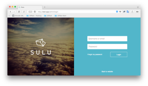
By adding some styling, this is how the toolbar looks:

To create a toolbar, you use the <mat-toolbar> component and then you create one or multiple rows inside the toolbar using the the <mat-toolbar-row> component.
Notice that we have imported the MatToolbarModule and MatButtonModule modules from @angular/material in the material.module.ts.
You can also make use of other navigation components such as menus and sidebars.
Building the UI for the Login Component
After creating the UI for the root component of our application, let’s create the UI for the login component.
Open src/app/login/login.component.html and add the following HTML code. Add an Angular Material card to contain the login form:
<mat-card  class="login-card">
<mat-card-header>
    <mat-card-title>Login</mat-card-title>
</mat-card-header>
    <mat-card-content>
    <!-- The form goes here -->
    </mat-card-content>
A <mat-card> component serves as a single-object container for text, photos, and actions. Find more details about cards from the docs.
Next in the content section of the card, add the HTML form:
    <form  class="login-form">
        <!-- Form elements are here -->
    </form>
Now let’s add two inputs to get the user’s username and password credentials:
<mat-form-field>
<input  matInput  placeholder="Username" [(ngModel)]="username"  name="username"  required>
</mat-form-field>
<mat-form-field>
<input  matInput  placeholder="Password" [(ngModel)]="password"  type="password"  name="password"  required>
</mat-form-field>
Many Angular Material components need to be wrapped inside a
These are the components that are designed to be wrapped inside <mat-form-field>:
Finally, in the actions section of the card, let’s add an Angular Material button for the login action:
<mat-card-actions>
    <button  mat-raised-button (click)="login()"  color="primary">Login</button>
</mat-card-actions>
</mat-card>
To create an Angular Material button, you simply use native HTML <button> and <a> elements and add Material attributes such as mat-button and mat-raised-button. For more details, check the docs.
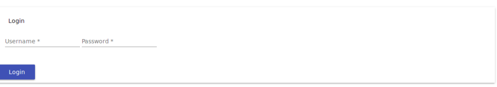
This is how the login form looks:
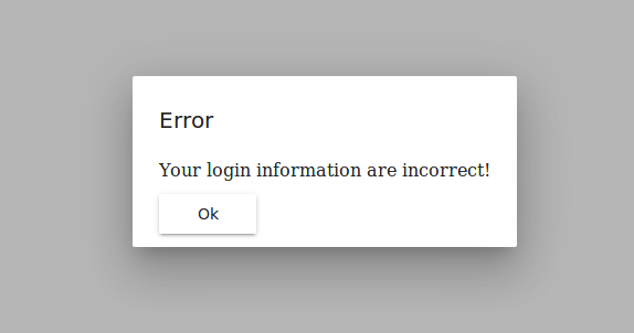
If the login is successful (username: demo, password: demo) the user will be redirected to the CustomerList component. Otherwise, the user will get an error message: “Your login information are incorrect!”
Create the Error Modal Dialog
MatDialog can be used to create and open modal dialogs. The dialog requires a component to be loaded, so first create an Angular component that displays the error message that gets passed.
Create src/app/error.component.ts, then add the following code:
import {Component, Inject, Injectable} from  '@angular/core';

import {MatDialogRef, MAT_DIALOG_DATA, MatDialog} from  '@angular/material';

@Component({
templateUrl:  'error.component.html'
})
export  class  ErrorComponent {
    constructor(private  dialogRef:  MatDialogRef<ErrorComponent>, @Inject(MAT_DIALOG_DATA) public  data:  any) {
    }
    public  closeDialog() {
        this.dialogRef.close();
    }
}
This component will be created and opened with MatDialog so it can inject MatDialogRef, which provides a handle on the opened dialog and can be used to close the dialog and receive notifications when the dialog gets closed. (The closeDialog() method uses this reference to close the dialog.)
Our error component needs a way to get the error message to be displayed for the user. (The message will be passed when the component is opened using MatDialog open method.) You can access the data in your dialog component using the MAT_DIALOG_DATA injection token that can be imported from '@angular/material' and then injected into the component using @Inject().
Next, create src/app/error.component.html and add the following code:
<h2  mat-dialog-title>Error</h2>
<mat-dialog-content  class="error">{{data.message}}</mat-dialog-content>
<mat-dialog-actions>
<button  mat-raised-button (click)="closeDialog()">Ok</button>
</mat-dialog-actions>
We’re using many available directives for structuring the dialog components:
mat-dialog-title: used for the dialog title, and needs to be applied to heading elements<h1>,<h2>etc.<mat-dialog-content>: used for the scrollable content of the dialog<mat-dialog-actions>: used as a container for dialog actions.
Next, open src/app/app.module.ts and add this component to the module:
@NgModule({

declarations: [

/*...*/
    ErrorComponent
],

imports: [/*...*/
],
entryComponents: [ErrorComponent],
/*...*/
})

export  class  AppModule { }
Now let’s add the login() method (to trigger the error dialog) to the LoginComponent:
import { Component, OnInit } from  '@angular/core';
import { MatDialog, MatDialogRef } from  '@angular/material';

/* ... */

@Component({
/* ... */
})
export  class  LoginComponent{

    public  username:  string  =  "";
    public  password:  string  =  "";


    constructor(private  dialog:  MatDialog, private  router:  Router) { }
    login(){
        if(this.username  ===  "demo"  &&  this.password  === "demo")
        {
            this.router.navigate(['customer-list']);
        }
        else
        {
            this.dialog.open(ErrorComponent,{ data: {
            message:  "Your login information are incorrect!"
            }});
        }
    }
}
We simply inject the MatDialog component and use it to open a dialog (if the user credentials aren’t correct) with the ErrorComponent component and a config object holding the data that will be passed. The open() method returns an instance of MatDialogRef.
This is a screenshot of the error dialog:
You can find more information about dialogs from the docs.
Building the UI for the CustomerList Component
For the CustomerList component we’ll make use of different Angular Material components, most importantly:
Open src/app/customer-list/customer-list.component.html and add the following markup:
<div  class="mat-elevation-z8">
<!-- Other contents here -->
</div>
the mat-elevation-z8 class is an Angular Material elevation class that allows you to add separation between elements along the z-axis. You can find more details from this link.
Adding a Loading Spinner
We use <mat-spinner> to display a spinner when data is still loading, which we’re simulating using a setTimeout() function:
<mat-spinner [style.display]="loading ? 'block' : 'none'"></mat-spinner>
If the loading variable equates to true, the CSS display property gets assigned the block value. Otherwise, it gets assigned none which makes it disappear.
You need to add a loading variable to the component class, which initially takes a value of true.
    loading  =  true;
    /*...*/
    constructor() {}
ngOnInit():  void {

    setTimeout(() => {

        this.loading  =  false;

    }, 2000);

    /*...*/
Adding a Data Table with a Data Source
We then create a Material data table using <mat-table> that gets displayed only if loading equals false:
<mat-table [style.display]="loading === false ? 'block' : 'none'" #table [dataSource]="dataSource">
<!-- Other contents here -->
</mat-table>
The data table takes a dataSource property that’s used to provide data for the table. You can simply pass a data array to the table, but for real-world use cases you need to use an advanced data source such as MatTableDataSource, provided by Angular Material, that encapsulates logic for advanced operations such as pagination, sorting and filtering:
export  class  CustomerListComponent  implements  OnInit {

    customers:  Customer[] = [
    { id:1, name:'Customer 001',job:'Programmer'},
    /*...*/
    ];

    dataSource  =  new  MatTableDataSource<Customer>(this.customers);
Adding Column Templates
For each column definition, you need to provide a unique name and the content for its header and row cells. For example, this is the column for displaying the customer ID:
<ng-container  matColumnDef="id">
<mat-header-cell *matHeaderCellDef> CustomerId </mat-header-cell>
<mat-cell *matCellDef="let customer"> {{customer.id}} </mat-cell>
</ng-container>
This is a simple column definition with the name id. The header cell contains the text CustomerId and each row cell will render the id property of each row’s data.
In a similar way, you can add the other column definitions.
For the operations column, we’re using two Angular Material icons: delete and edit wrapped with Material buttons:
<ng-container  matColumnDef="operations">

<mat-header-cell *matHeaderCellDef  mat-sort-header> Operations </mat-header-cell>

<mat-cell *matCellDef="let element">  <button  mat-button  color="primary" (click)="deleteCustomer(element.id)"><mat-icon>delete</mat-icon>

</button>  <button  mat-button  color="primary" (click)="editCustomer(element.id)"><mat-icon>edit</mat-icon></button>  </mat-cell>

</ng-container>
Adding Row Templates
After defining column templates, you need to define the row templates, so first you need to add a variable that contains the list of columns you have to the component:
displayedColumns = ['id', 'name', 'job', 'operations'];
Next you need to add <mat-header-row> and <mat-row> to the content of your <mat-table> and provide your column list as inputs:
<mat-header-row *matHeaderRowDef="displayedColumns"></mat-header-row>
<mat-row *matRowDef="let row; columns: displayedColumns;"></mat-row>
Adding Pagination
You can add pagination to your data table by simply adding a <mat-paginator> component after <mat-table>:
<mat-paginator #paginator [style.display]="loading === false ? 'block' : 'none'" [pageSize]="5"></mat-paginator>
One benefit of using MatTableDataSource is that you get pagination out of the box by simply providing MatPaginator to your data source.
First make sure you import the MatPaginatorModule in material.module.ts. Then you need to get the paginator directive:
@ViewChild(MatPaginator) paginator: MatPaginator;
Finally, you just pass the paginator to the table’s data source:
ngAfterViewInit() {
    this.dataSource.paginator  =  this.paginator;
}
Adding Sorting
Using MatTableDataSource you can also have sorting out of the box by only adding a few things.
First, make sure you have MatSortModule imported in your module (material.module.ts).
Next, add the matSort directive to the <mat-table> component and then add mat-sort-header to each column header cell that needs to have sorting.
For example, let’s add sorting to the name column:
<ng-container  matColumnDef="name">
<mat-header-cell *matHeaderCellDef  mat-sort-header> Name </mat-header-cell>
<mat-cell *matCellDef="let customer"> {{customer.name}} </mat-cell>
</ng-container>
Finally, you need to provide the MatSort directive to the data source and it will automatically have sorting:
import {MatTableDataSource, MatPaginator, MatSort} from  '@angular/material';
/*...*/
export  class  CustomerListComponent  implements  OnInit {

@ViewChild(MatSort) sort:  MatSort;

ngAfterViewInit() {
    /*...*/
    this.dataSource.sort  =  this.sort;
}
You can also add filtering and selection to your table. Check the docs for more information.
Using MatTableDataSource provides you with many built-in features out of the box, but it only supports client-side pagination. For server-side pagination or other custom features, you need to create your custom data source.
In the case of a custom data source, you’ll need to listen to the paginator’s (page) event to implement pagination and to the sort’s (matSortChange) event for implementing data sorting.
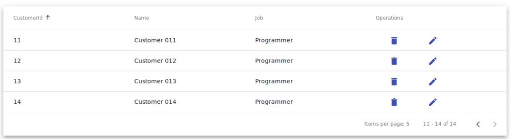
This is a screenshot of the CustomerList component:
Adding SnackBar Notifications
First make sure you’ve imported MatSnackBarModule into your module. Next, import and inject MatSnackBar into your component, then simply call the open() method of the MatSnackBar instance:
import {MatSnackBar} from  '@angular/material';
/*...*/
constructor(public  snackBar:  MatSnackBar) {}

deleteCustomer(id){
    let  snackBarRef  =  this.snackBar.open(`Deleting customer #${id}`);
}
editCustomer(id){
    let  snackBarRef  =  this.snackBar.open(`Editing customer #${id}`);
}
Building the UI for the CustomerCreate Component
For the CustomerCreate component, we’ll use a bunch of Angular Material components, such as:
- the card component (
<mat-card>) - the tabs component (
<mat-tab>and<mat-tab-group>) - the label (
<mat-label>) and input (<input matInput>and<textarea matInput>) components - the form field (
<mat-form-field>) component - the checkbox (
<mat-checkbox>) component - the date picker (
<mat-datepicker>) component - the radio button (
<mat-radio-button) component - the select (
<mat-select>) component.
So open src/app/customer-create/customer-create.component.html and start by adding the card component that holds the customer creation form:
<mat-card  class="my-card">
<mat-card-header>
    <mat-card-title>Create Customer</mat-card-title>
</mat-card-header>

    <mat-card-content>
    <!-- The form goes here -->
    </mat-card-content>
    <mat-card-actions>
    <!-- Actions go here -->
    </mat-card-actions>
</mat-card>
In the card content section, let’s add an HTML form:
<form  class="my-form">
<!-- Form fields here -->
</form>
Next, let’s organize the form fields into horizontal tabs using the Angular Material tabs components. Inside the form element, add the following code to create two tabs with General Information and Other Information labels:
<mat-tab-group>
<mat-tab  label="General Information"  class="my-tab">
<!-- Form fields here -->
</mat-tab>
<mat-tab  label="Other Information"  class="my-tab">
<!-- Form fields here -->
</mat-tab>
</mat-tab-group>
In each tab, we’ll add an HTML table to organize the form fields into table cells:
<table  style="width: 100%"  cellspacing="10">
<tr>
    <td> <!-- Form fields here --> </td>
</tr>
</table>
Add the following content for the first tab. Inside the table row/cell, add a field for the customer name:
<mat-form-field>
    <mat-label>Name</mat-label>
    <input  matInput  placeholder="Name" [(ngModel)]="name"  name="name"  required>
</mat-form-field>
Next create an input for the customer address:
<mat-form-field>
    <mat-label>Address</mat-label>
    <textarea [(ngModel)]="address"  matInput></textarea>
</mat-form-field>
Finally, create an input field for the customer email:
<mat-form-field>
    <mat-label>Email</mat-label>
    <input  matInput  placeholder="Email" [(ngModel)]="email"  name="email">
</mat-form-field>
We’re using <mat-label> to create labels, <input matInput /> to create an input field, and <textarea matInput> to create a text area field.
For the second tab, add the following content. In the first row/cell of the table, add the Is company? checkbox:
<mat-checkbox [checked]="isCompany">Is company?</mat-checkbox>
The checked property determines if the checkbox is checked or not.
Next, add a date input with a date picker wrapped inside an Angular Material form field:
<mat-form-field>
    <mat-label>Created At</mat-label>
    <input  [value]="createdAt.value" matInput [matDatepicker]="picker"  placeholder="Date of creation">
    <mat-datepicker-toggle  matSuffix [for]="picker"></mat-datepicker-toggle>
    <mat-datepicker #picker></mat-datepicker>
</mat-form-field>
As explained in the Angular mMaterial docs:
The datepicker allows users to enter a date either through text input, or by choosing a date from the calendar. It is made up of several components and directives that work together.
Next, add a group of radio buttons to choose the gender of the customer:
<mat-label>Gender</mat-label>
<mat-radio-group [(value)]="selectedGender">
    <mat-radio-button  value="male">Male</mat-radio-button>
    <mat-radio-button  value="female">Female</mat-radio-button>
</mat-radio-group>
To get the currently selected radio button inside the group, simply bind a variable to the value property.
Finally, add a select field to select the source of the lead/customer:
<mat-form-field>
    <mat-label>Lead Source</mat-label>
        <mat-select [(value)]="selectedSource" placeholder="Source">
        <mat-option>None</mat-option>
        <mat-option value="email">Email Marketing</mat-option>
        <mat-option value="social">Social Media</mat-option>
        <mat-option value="affiliate">Affiliate</mat-option>
    </mat-select>
</mat-form-field>
The <mat-select> component supports two-way binding to the value property without the need for Angular forms.
Now let’s add a button to create the customer from the form information:
<mat-card-actions>
    <button  mat-raised-button (click)="createCustomer()"  color="primary">Create</button>
</mat-card-actions>
Now you need to create variables that are bound to these controls. In src/app/customer-create/customer-create.component.ts, add the following code to the component class:
name:  string  =  "";
email:  string  =  "";
job:  string  =  "";
address:  string  =  "";
selectedSource:  string  =  "email";
selectedGender:  string  =  "male";
isCompany  :  boolean  =  false;
createdAt  =  new  FormControl(new  Date());
public  createCustomer(){
/* logic to create a customer from the form information*/
}
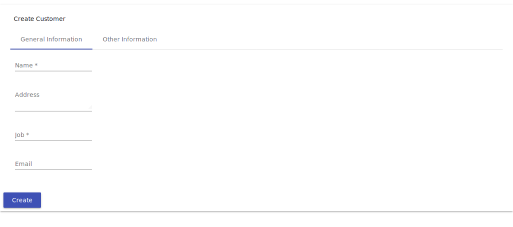
This is a screenshot of the component UI:
You can see a live demo of this here.
Conclusion
With internationalization, accessibility, freedom from bugs and high performance, Angular Material aims to build a set of high-quality UI components using Angular and based on the Material design specification.
In this tutorial, we’ve built a simple UI using Angular Material with a variety of UI components. You can find the complete set of available Angular Material components from the Angular Material docs.
You can find the source code of the demo we’ve built throughout this tutorial in this GitHub repository.
Frequently Asked Questions on Angular Material Design Components
What are the key features of Angular Material Design Components?
Angular Material Design Components are a set of pre-built, modular, and reusable components that implement Material Design. They offer a wide range of features including pre-built UI components, responsive layouts, and powerful theming capabilities. These components are designed to be easy to use, customizable, and fully compatible with Angular applications. They also support accessibility standards, ensuring that your applications are accessible to as many users as possible.
How can I install Angular Material Design Components in my project?
To install Angular Material Design Components, you need to have Node.js and npm installed on your machine. Once you have these prerequisites, you can install Angular Material using the following command in your terminal: npm install @angular/material. After installation, you can import the Angular Material modules you want to use in your application.
How can I use Angular Material Design Components in my application?
After installing Angular Material, you can use its components in your application by importing the necessary modules in your app.module.ts file. For example, if you want to use the MatButton module, you would import it like this: import {MatButtonModule} from '@angular/material/button'; and then add it to the imports array in your @NgModule decorator.
How can I customize the look and feel of Angular Material Design Components?
Angular Material Design Components support powerful theming capabilities. You can customize the look and feel of the components by defining your own custom themes. A theme is defined by a set of colors that include a primary color, an accent color, and a warning color. You can also customize typography and spacing.
What is elevation in Angular Material Design Components?
Elevation in Angular Material Design Components refers to the perceived distance between two surfaces. It is used to create visual cues about the relative importance and hierarchy of elements on a page. Elevation values are implemented as a box-shadow CSS property and can range from 0 to 24.
How can I define an elevation in Angular Material Design Components?
You can define an elevation in Angular Material Design Components by using the mat-elevation-z CSS classes, where z is the desired elevation level. For example, to apply an elevation of 4 to a component, you would add the class mat-elevation-z4 to the component’s HTML element.
How can I handle user interactions with Angular Material Design Components?
Angular Material Design Components provide a variety of ways to handle user interactions. For example, you can use Angular’s event binding syntax to respond to user events like clicks or key presses. Additionally, many components have built-in support for user interactions like hover, focus, and ripple effects.
How can I make my Angular Material Design Components responsive?
Angular Material Design Components support responsive layouts through the use of the Angular Flex Layout module. This module provides a flexible and responsive grid system that allows you to specify how your components should be laid out on different screen sizes.
How can I ensure accessibility with Angular Material Design Components?
Angular Material Design Components are designed with accessibility in mind. They follow the WAI-ARIA guidelines for accessibility and include features like focus management, keyboard navigation, and screen reader support. You can further enhance accessibility by using semantic HTML and providing alternative text for images.
How can I troubleshoot issues with Angular Material Design Components?
If you encounter issues with Angular Material Design Components, you can start by checking the official documentation and the GitHub repository for known issues. You can also ask questions on StackOverflow or the Angular Material Gitter channel. If you believe you’ve found a bug, you can report it on the GitHub issue tracker.
 Ahmed Bouchefra
Ahmed is a technical author and web developer living in Morocco with a Master's degree in software development. He authors technical content about JavaScript, Angular and Ionic. He is also a fan of entrepreneurship, poetry, and teaching. You can contact me on my personal website and read my other articles on Techiediaries.