Optimizing Google Fonts Performance
It’s fair to say Google Fonts are popular. As of writing, they have been viewed over 29 trillion times across the web and it’s easy to understand why — the collection gives you access to over 900 beautiful fonts you can use on your website for free. Without Google Fonts you would be limited to the handful of “system fonts” installed on your user’s device.
System fonts or ‘Web Safe Fonts’ are the fonts most commonly pre-installed across operating systems. For example, Arial and Georgia are packaged with Windows, macOS and Linux distributions.
Like all good things, Google Fonts do come with a cost. Each font carries a weight that the web browser needs to download before they can be displayed. With the correct setup, the additional load time isn’t noticeable. However, get it wrong and your users could be waiting up to a few seconds before any text is displayed.
Google Fonts Are Already Optimized
The Google Fonts API does more than just provide the font files to the browser, it also performs a smart check to see how it can deliver the files in the most optimized format.
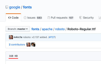
Let’s look at Roboto, GitHub tells us that the regular variant weighs 168kb.

However, if I request the same font variant from the API, I’m provided with this file. Which is only 11kb. How can that be?
When the browser makes a request to the API, Google first checks which file types the browser supports. I’m using the latest version of Chrome, which like most browsers supports WOFF2, so the font is served to me in that highly compressed format.
If I change my user-agent to Internet Explorer 11, I’m served the font in the WOFF format instead.
Finally, if I change my user agent to IE8 then I get the font in the EOT (Embedded OpenType) format.
Google Fonts maintains 30+ optimized variants for each font and automatically detects and delivers the optimal variant for each platform and browser.
— Ilya Grigorik, Web Font Optimization
This is a great feature of Google Fonts, by checking the user-agent they are able to serve the most performant formats to browsers that support those, while still displaying the fonts consistently on older browsers.
Browser Caching
Another built-in optimization of Google Fonts is browser caching.
Due to the ubiquitous nature of Google Fonts, the browser doesn’t always need to download the full font files. SmashingMagazine, for example, uses a font called ‘Mija’, if this is the first time your browser has seen that font, it will need to download it completely before the text is displayed, but the next time you visit a website using that font, the browser will use the cached version.
As the Google Fonts API becomes more widely used, it is likely visitors to your site or page will already have any Google fonts used in your design in their browser cache.
— FAQ, Google Fonts
The Google Fonts browser cache is set to expire after one year unless the cache is cleared sooner.
Note: Mija isn’t a Google Font, but the principles of caching aren’t vendor-specific.
Further Optimization Is Possible
While Google invests great effort in optimizing the delivery of the font files, there are still optimizations you can make in your implementation to reduce the impact on page load times.
1. Limit Font Families
The easiest optimization is to simply use fewer font families. Each font can add up to 400kb to your page weight, multiply that by a few different font families and suddenly your fonts weigh more than your entire page.
I recommend using no more than two fonts, one for headings and another for content is usually sufficient. With the right use of font-size, weight, and color you can achieve a great look with even one font.

2. Exclude Variants
Due to the high-quality standard of Google Fonts, many of the font families contain the full spectrum of available font-weights:
- Thin (100)
- Thin Italic (100i)
- Light (300)
- Light Italic (300i)
- Regular (400)
- Regular Italic (400i)
- Medium (600)
- Medium Italic (600i)
- Bold (700)
- Bold Italic (700i)
- Black (800)
- Black Italic (800i)
That’s great for advanced use-cases which might require all 12 variants, but for a regular website, it means downloading all 12 variants when you might only need 3 or 4.
For example, the Roboto font family weighs ~144kb. If however you only use the Regular, Regular Italic and Bold variants, that number comes down to ~36kb. A 75% saving!
The default code for implementing Google Fonts looks like this:
<link href="https://fonts.googleapis.com/css?family=Roboto" rel="stylesheet">
If you do that, it will load only the ‘regular 400’ variant. Which means all light, bold and italic text will not be displayed correctly.
To instead load all the font variants, we need to specify the weights in the URL like this:
<link href="https://fonts.googleapis.com/css?family=Roboto:100,100i,300,300i,400,400i,500,500i,700,700i,900,900i" rel="stylesheet">
It’s rare that a website will use all variants of a font from Thin (100) to Black (900), the optimal strategy is to specify just the weights you plan to use:
<link href="https://fonts.googleapis.com/css?family=Roboto:400,400i,600" rel="stylesheet">
This is especially important when using multiple font families. For example, if you are using Lato for headings, it makes sense to only request the bold variant (and possibly bold italic):
<link href="https://fonts.googleapis.com/css?family=Lato:700,700i" rel="stylesheet">
3. Combine Requests
The code snippet we worked with above makes a call to Google’s servers (fonts.googleapis.com), that’s called an HTTP request. Generally speaking, the more HTTP requests your web page needs to make, the longer it will take to load.
If you wanted to load two fonts, you might do something like this:
<link href="https://fonts.googleapis.com/css?family=Open+Sans:400,400i,600" rel="stylesheet">
<link href="https://fonts.googleapis.com/css?family=Roboto" rel="stylesheet">
That would work, but it would result in the browser making two requests. We can optimize that by combining them into a single request like this:
<link href="https://fonts.googleapis.com/css?family=Roboto|Open+Sans:400,400i,600" rel="stylesheet">
There is no limit to how many fonts and variants a single request can hold.
4. Resource Hints
Resource hints are a feature supported by modern browsers which can boost website performance. We are going to take a look at two types of resource hint: ‘DNS Prefetching’ and ‘Preconnect’.
Note: If a browser doesn’t support a modern feature, it will simply ignore it. So your web page will still load normally.
DNS Prefetching
DNS prefetching allows the browser to start the connection to Google’s Fonts API (fonts.googleapis.com) as soon as the page begins to load. This means that by the time the browser is ready to make a request, some of the work is already done.
To implement DNS prefetching for Google Fonts, you simply add this one-liner to your web pages `
`:<link rel="dns-prefetch" href="//fonts.googleapis.com">
Preconnect
If you look at the Google Fonts embed code it appears to be a single HTTP request:
<link href="https://fonts.googleapis.com/css?family=Roboto:400,400i,700" rel="stylesheet">
However, if we visit that URL we can see there are three more requests to a different URL, https://fonts.gstatic.com. One additional request for each font variant.

The problem with these additional requests is that the browser won’t begin the processes to make them until the first request to https://fonts.googleapis.com/css is complete. This is where Preconnect comes in.
Preconnect could be described as an enhanced version of prefetch. It is set on the specific URL the browser is going to load. Instead of just performing a DNS lookup, it also completes the TLS negotiation and TCP handshake too.
Just like DNS Prefetching, it can be implemented with one line of code:
<link rel="preconnect" href="https://fonts.gstatic.com/" crossorigin>
Just adding this line of code can reduce your page load time by 100ms. This is made possible by starting the connection alongside the initial request, rather than waiting for it to complete first.
5. Host Fonts Locally
Google Fonts are licensed under a ‘Libre’ or ‘free software’ license, which gives you the freedom to use, change and distribute the fonts without requesting permission. That means you don’t need to use Google’s hosting if you don’t want to — you can self-host the fonts!
All of the fonts files are available on Github. A zip file containing all of the fonts is also available (387MB).
Lastly, there is a helper service that enables you to choose which fonts you want to use, then it provides the files and CSS needed to do so.
There is a downside to hosting fonts locally. When you download the fonts, you are saving them as they are at that moment. If they are improved or updated, you won’t receive those changes. In comparison, when requesting fonts from the Google Fonts API, you are always served the most up-to-date version.

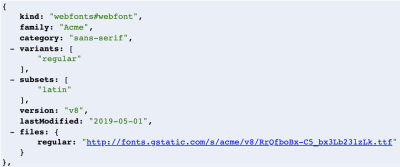
Note the lastModified parameter in the API. The fonts are regularly modified and improved.
6. Font Display
We know that it takes time for the browser to download Google Fonts, but what happens to the text before they are ready? For a long time, the browser would show blank space where the text should be, also known as the "FOIT” (Flash of Invisible Text).
Recommended Reading: “FOUT, FOIT, FOFT” by Chris Coyier
Showing nothing at all can be a jarring experience to the end user, a better experience would be to initially show a system font as a fallback and then “swap” the fonts once they are ready. This is possible using the CSS font-display property.
By adding font-display: swap; to the @font-face declaration, we tell the browser to show the fallback font until the Google Font is available.
    @font-face {
    font-family: 'Roboto';
    src: local('Roboto Thin Italic'),
  url(https://fonts.gstatic.com/s/roboto/v19/KFOiCnqEu92Fr1Mu51QrEz0dL-vwnYh2eg.woff2)
  format('woff2');
    font-display: swap;
  }
In 2019 Google, announced they would add support for font-display: swap. You can begin implementing this right away by adding an extra parameter to the fonts URL:
https://fonts.googleapis.com/css?family=Roboto&display=swap
7. Use the Text Parameter
A little known feature of the Google Fonts API is the text parameter. This rarely-used parameter allows you to only load the characters you need.
For example, if you have a text-logo that needs to be a unique font, you could use the text parameter to only load the characters used in the logo.
It works like this:
https://fonts.googleapis.com/css?family=Roboto&text=CompanyName
Obviously, this technique is very specific and only has a few realistic applications. However, if you can use it, it can cut down the font weight by up to 90%.
Note: When using the text parameter, only the “normal” font-weight is loaded by default. To use another weight you must explicitly specify it in the URL.
https://fonts.googleapis.com/css?family=Roboto:700&text=CompanyName
Wrapping Up
With an estimated 53% of the top 1 million websites using Google Fonts, implementing these optimizations can have a huge impact.
How many of the above have you tried? Let me know in the comments section.


 Flexible CMS. Headless & API 1st
 Register!


