v2.0.0
v2.0.0 (Arcadia)
Welcome to the v2.0.0 release of Vuetify!
Before getting into the actual release introduction, I wanted to take a moment of your time to talk about project sponsorship and a unique opportunity that I've been fortunate enough to be a part of.
Version 2.0 represents the culmination of 8 months of development. Through the combined efforts of numerous developers, we have been able to bring the largest update we have ever had — the framework has never felt better.
Github has recently released a new program called Github Sponsors, something I've been fortunate enough to receive a beta invite for. Some of you know that I currently run a Patreon campaign for the same purpose. With my invite, I have started to transition supporters to the new platform due to the amazing benefits that Github is offering. What that is in a nutshell:
- Funding matching for the 1st year
- Waived processing fees for the 1st year
- Offered on a platform that more people know and are comfortable with
With that being said, I wanted to quickly talk about the 3 pillars of support available with sponsorship and highlight how it can benefit developers and businesses that use Vuetify.
Single developer
- Sponsor support channel
- Vue/Vuetify consulting services
Company
- Elite Sponsor support channel (direct support from me)
- Monthly live support calls
- Github issue prioritization
Enterprise
- Subscription based model through Tidelift
- Github issue prioritization
The generous fund matching program from Github provides a rare opportunity for me to be able to invest more into the Vuetify ecosystem and continue to provide developers with a polished and expansive library for Vue.
Thank you for your support and please consider sponsoring the project.
If you have any questions, please do not hesitate to reach out to me in the community. Thank you for using Vuetify!
—John
📖 Table of Contents
#Release Introduction
#Important Links
#New Components & Features
#Documentation Updates
#Upgrade Guide
#Release Notes
#Known Issues
#I need help! 🆘
💥 Release Introduction
Hello and welcome to the v2.0 release, Arcadia. It has been almost 8 months since development kicked off and I believe we have accomplished something very special. As described in my talk in last year's VueConf TO presentation, we have performed a massive overhaul to every aspect of the framework, making it easier to use and maintain.
- Updated every component to the new Material Design 2 specification
- Added an improved grid system
- Every component has been updated with proper accessibility (a11y) support
- Every component has been updated with proper bidirectionality (rtl) support
- Converted from stylus to sass
- Converted from javascript to typescript
- Converted from avoriaz to vue-test-utils
- Moved all styles and unit tests into its corresponding component's folder
This is only a small list of overall framework improvements from quality of life changes, to new features and functionality (outside of the MD2 improvements). The documentation has been massively updated with over 250 new examples, tons of updated information on how to use the framework's internals, details on long-term support, an extended roadmap and a better API display for components. We have also setup a process for exporting the component api for vetur so that it is easier for us to keep it up to date.
I have also teamed up with Vue Mastery to bring high-quality tutorials into the Vuetify ecosystem. This video series has been developed around using version 2, is taught by Ben Hong and is perfect for new and experienced Vuetify developers alike. Make sure to check it out!
Since early alpha, we have been working with the community on small and large projects to ensure we have an easy and managable upgrade process from v1.5. Kael has even created an eslint-plugin to make the process of upgrading to the new grid even easier. If you run into any issues that do not appear to be covered in the Upgrade guide, please reach out to a developer in the release migration channel.
I'd like to give a huge thank you to everyone for your unwaivering support and for enabling me to work on open source as a full-time job. For the first time in the framework's history, I feel like we have a solid base for maintaining and developing new features and I've never been more excited for the future. Finally, while this release was an effort by many Vuetify developers, I would like to send a special thank you to some that went above and beyond in ensuring the v2 release was as polished as possible. In no particular order:
Thank you everyone for using Vuetify!
—John
❗️ Important Links
Documentation
Becoming a Github Sponsor (supports the author, John)
Becoming a backer on OpenCollective (supports the development team)
Become a subscriber on Tidelift (supports the author, John)
Consulting with the author, John
Community discord
Twitter
Medium publication
Shop
🤚 FAQ
- What will be happening to v1.5?
- No more features
- Issues will be resolved on a case by case basis. Any security vulnerabilities will also be fixed.
- Long-term support until July 2020
- Will the light and dark theme variants apply to individual components? (e.g. a light theme application with a dark
<v-card>)- No. Variants only apply from the designation of $vuetify.theme.dark being
booleantrue or false.
- No. Variants only apply from the designation of $vuetify.theme.dark being
- My application is saying "Cannot read dark of undefined"
- Make sure that you have properly followed the upgrade guide.
- Is it still possible to view the v1.5 documentation?
- Should I upgrade to v1.5 before upgrading to v2.0?
- Yes, you can find a list of upgrade guides on the Long-term support page
- Where can I suggest changes to the upgrade guide?
- In the #release-migration channel on discord
⚡ New Components & Features
🔗 VAppBar
Brand new component that was created to better scope the functionality of v-toolbar. All existing scrolling techniques and app functionality from v-toolbar has been moved. New scrolling techniques such as collapsing bar, scroll shrink and more have been added.

🔗 VBanner
Brand new component introduced in MD2. You can find more information in the banner specification.

🔗 VChipGroup
Brand new component for grouping multiple v-chips together in a column or row based format.


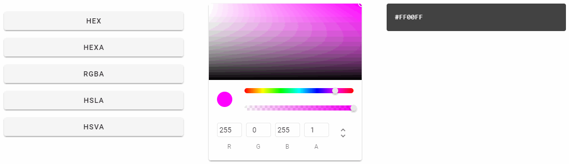
🔗 VColorPicker
Brand new component designed to making color selection a breeze. With 5 available formats, hex, hexa, rgba, hsla and hsva, v-color-picker can accommodate a wide variety of use cases.

🔗 VFileInput
The long awaited and highly anticipated file upload component. The v-file-input is aimed to replacing the default functionality and behavior of a regular <input type="file">. It features a multitude of customization options for tweaking the way selections are displayed, all of the available styling of v-text-field and more.


Developers notes: You may be wondering about 2 things: built in upload support and drag-and-drop. There will be an upcoming second component, v-upload, that is designed to have a more visual interface for manipulating file uploads and will support xml requests. With its introduction, we will be bringing drag-and-drop to both upload components.
🔗 VListItemGroup
Brand new component for grouping multiple v-list-items together.

🔗 VOverlay
A staple feature that was previously integrated as part of dialogs and navigation-drawers has been abstracted into its own component for consumption.


🔗 VSimpleTable
Meant to be a replacement for a generic table element.


🔗 VSlideGroup
A new group component designed to provide the functionality of v-item-group within a custom slide interface.

📃 Documentation Updates
- Over 250 new examples
- Heavy focus on providing examples for all props
- Added playgrounds
- Improved property descriptions with relevant links to corresponding functionality
- Added snippets for object based properties displaying what properties are available
- Individual property descriptions coming soon
- Improved existing information on advanced Vuetify usage with more examples and better explanations
- Brand new API design for components
- Numerous a11y improvements throughout the docs
- Greatly improved performance with lazy loading
💯 Release notes
Below is a consolidated list of changes made in v2. Every component that has a MD2 specification has been updated to match (with the exception of the known issues below). Every component that has a MD1 specification (and not 2) has been re-verified and updated to ensure that it matches the previous spec.
New Components
New components are listed under the New Components & Features section.
Framework
- Rebuilt the entire core for better usability and maintainability
- Scoped all Vuetify global styles to
.v-application - Added theme support for default anchor colors
- All components are now lazy by default meaning they will not render their content unless activated. This can be overriden with the eager prop
- Converted all components and functionality from javascript to typescript
- Converted all components and functionality from stylus to sass
- Converted all unit tests from avoriaz to vue-test-utils
- Added support for dark and light theme color palettes
- Issues closed:
Grid & Helper classes
- Rebuilt using the bootstrap-style grid system
- Added negative margin helper classes:
.pr-n4appliesmargin-right: -16px - Added more responsive helper classes:
.pa-md-6,.justify-lg-center,.order-sm-first,.float-lg-rightetc - Made using flex helper classes easier:
.flex-grow-1and.flex-shrink-0instead of.grow/.shrink - Added new rtl/ltr start/end spacing and alignment helper classes:
.ps-md-6, '.me-1' (sstands forstart,estands forend),.text-startetc - Helper classes are now scoped with
.v-application- it means that they won't interfere with similarly named classes from other frameworks if they are used outside of the Vuetify application - Issues closed:
Typography
- Added new helper classes
.subtitle-1.subtitle-2.overline
Vetur Support
- Releases of Vuetify now include auto-generated files for tags and attributes to allow for accurate Vetur auto-completion.
Alerts
- Added a11y support
- Added new properties
- border - Apples a border to the designated direction, top, right, bottom and left
- colored-border - Applies the current color to the alert's border
- prominent - Increases the height and icon size
- text - Applies the defined color to text and a low opacity background of the same
Badges
- Added support for having more than 1 character
- Issues closed:
BottomNavigation
- Added new properties
- horizontal - Positions icons to the right of text as opposed to stacked vertically
BottomNavigation
- Added new properties
- tile - Removes the border radius
Breadcrumbs
- Added a11y support
Calendars
- Improved event interaction
- Fixed next/prev with irregular weekdays
- Will now throw an error when no days are available
- Renamed all scoped slots to use kebab-case
- Issues closed:
Cards
- Added new properties
- link - Explicitly applies link styling (href/to), can now be focused
- loading - Can now be put into a loading state (similar to buttons)
- outlined - Removes elevation and adds a thin border around the card
- tile - Removes the border radius
Carousels
- Added new properties
- vertical-delimiters - Changes delimiters from horizontal to vertical
- progress - Displays current slide progress compared to total
Checkboxes
- Normalized indeterminate behavior with native checkbox input
Chips
- Can now be used as a
router-link - Added new properties
- filter - Displays a selection icon when selected
- filter-icon - Changes default icon used with the filter property
- link - Explicitly applies link styling (href/to)
- pill - Fits
v-avatarflush along edges - tag - Can now define a custom html tag
Comboboxes
- Resovled an issue where auto-select-first was not working properly
- Issues closed:
Data Tables
- Will now properly apply a background-color on Safari
- Removed opacity on sort arrows for better contrast ratio
- Made custom filter function more user friendly
- Issues closed:
Date Pickers
- Added language support for selected items translation
- Issues closed:
Dividers
- Added a11y support
Dialogs
- Added a11y support
- Will now emit an event when the user clicks outside of the dialog, click:outside
- Will now properly size card title, text and actions when using the scrollable property
- Issues closed:
Expansion Panels
Form Inputs
- Improved a11y
- Fixed validation state colors for all inputs
- Issues closed:
Icons
- Changed the default iconfont from Google Material Icons to Material Design Icons
- Added svg path support
- Turned off browser translation
- Added new properties
- tag - Can now define a custom html tag
- Issues closed:
Images
- Now uses inherited width from provided image
- Issues closed:
Inputs
- Will now properly apply provided attributes to the input element
- VInput: attrs should be applied on input not root element (#7579) (318553a), closes
- Issues closed:
Lists
- Added a11y support to all list based components
v-list- Added new properties
- flat - Removes elevation
- nav - An alternative styling that reduces
v-list-itemwidth and rounds the corners - rounded - Adds a large border radius
- shaped - Adds a large border radius on the top left/right of the item
- Added new properties
v-list-group- Will now propagate a click event when the activator is clicked
v-list-item-title- Will no longer cut off badges
- Closed issues:
Menus
- Added a11y support
Navigation Drawers
- Improved a11y support
- Added new properties
- expand-on-hover - Applies the mini state that expands on hover
- src - Can now apply a background
Parallaxes
- Will now show the image provided image cannot translate (not big enough)
- Issues closed:
Progress Linear
- Added new properties
- rounded - Adds a large border radius
- stream - Adds a new style to indicate loading
- striped - Adds a striped style
Ratings
- Icons will no longer wrap
- Issues closed:
Selects
- Added a11y support
- VSelect: resolve bug in safari/ie11 with event order disparity (5fa6a68), closes
- VSelect: tab selection (4963f72), closes #5614 #7544
- VSelect: set input type to hidden to fix potential layout issues (#7544) (bd35bee), closes
- Issues closed:
Developer notes: v-autocomplete, v-combobox and v-overflow-btn all benefit from a11y updates
Sheets
- Added new properties
- tile - Removes the border radius
Sliders
- Added new properties
- vertical - Positions the slider vertically
Sparklines
- Will now properly show custom labels when using the bars property
- Issues closed:
Tabs
- Improved a11y
- Improved touch support, allowing other touch based components that require swiping to properly work inside tabs items now
- Issues closed:
Text Fields
- Improve multiple style prop combination styles
- Added new properties
- filled - Replaces old box property
- rounded - Adds a large border radius
- shaped - Adds a large border radius on the top left/right of the item
- Removed the autocomplete prop, will now propagate to the inner input
- Prefix and suffix will no longer wrap under certain circumstances
- Will now check the existance of the input when refocusing after clearing
- Updated outlined style to match MD2 spec
- Issues closed:
Developer notes: v-select, v-textarea, v-file-input, v-autocomplete and v-combobox all benefit from the updated style properties
Textareas
Timelines
- Will no longer add carets to children cards
- Added new properties
- reverse - Reverses left/right positioning
- Issues closed:
TimePickers
- 0 hour/minute will now properly not work when disabled
Toolbars
- Improved a11y
Treeviews
- Will no longer emit model events on mounted
- Added new properties
- color - Designate a custom color for active nodes
- dense - Reduces the height of nodes
- item-disabled - Specifies a unique key for a disabled item
- rounded - Adds a large border radius
- selection-type - Controls how the
v-treeviewselects nodes. There are two modes available: leaf and independent - shaped - Adds a large border radius on the top left/right of the item
- Issues closed:
Windows
Individual Releases
Below are the changes from beta.9 to release:
🔧 Bug Fixes
- style: bring back .v-application scope to utility classes (#7921) (bf15ab7)
- utilities: allow multi-dimensional values (9ac0d11)
- VContainer: propagate id (4d575f8), closes #7919
- VData: typo in ts interface name (e4e01e9)
- VDataTable: make custom filter function more user friendly (#7885) (132ac8e)
- VIcon: add missing x-small prop functionality (9b77c73), closes #7873
- VList: disabled pointer events for disabled item (71771da)
- VSelect: add selection padding for outlined style (9566d4d)
- VSnackbar: update to better match md2 spec (9f12df7), closes #7772
- VTextField: properly align suffix in filled variant (126f891), closes #7871
- hyphenate remaining event names (#7917) (6fac25d)
🔁 Code Refactoring
- VDataTable: disable virtual-rows (8284ef5)
🚀 Features
- styles: float classes breakpointed (#7922) (26ad2e5), closes #7921
- VBtn: inherit justify-items from root (c028904), closes #7896
- VDataTable: change data-table scoped slot props structure (#7585) (878be3e)
- VDialog: add retainFocus prop (3681cd5), closes #6892
◀ Reverts
- docs(Validatable): fix a typo (#7851) (c70c078)
- fix(VDialog): focus the first child when tab leaves the dialog (513cb56), closes #6892
⚠ BREAKING CHANGES
- VDataTable: the virtual-rows prop (from alpha/beta) will no longer work
For the previous alpha/betas, check out the below releases:
Releases
- v2.0.0-beta.9
- v2.0.0-beta.8
- v2.0.0-beta.7
- v2.0.0-beta.6
- v2.0.0-beta.5
- v2.0.0-beta.4
- v2.0.0-beta.3
- v2.0.0-beta.2
- v2.0.0-beta.1
- v2.0.0-beta.0
- v2.0.0-alpha.20
- v2.0.0-alpha.19
- v2.0.0-alpha.18
- v2.0.0-alpha.17
- v2.0.0-alpha.16
- v2.0.0-alpha.15
- v2.0.0-alpha.14
- v2.0.0-alpha.13
- v2.0.0-alpha.12
- v2.0.0-alpha.11
- v2.0.0-alpha.10
- v2.0.0-alpha.9
- v2.0.0-alpha.8
- v2.0.0-alpha.7
- v2.0.0-alpha.6
- v2.0.0-alpha.5
- v2.0.0-alpha.4
- v2.0.0-alpha.3
- v2.0.0-alpha.2
- v2.0.0-alpha.1
- v2.0.0-alpha.0
🌐 New Locales
- Hebrew
- Korean
- Latvian
- Norwegian
😱 Known Issues
Here is a list of known issues that were not able to be resolved before the official release. There is no need to create an issue, these are explicitly tracked and will be resolved in an upcoming patch.- The upgraded grid does not have documentation
- Can view on API Explorer
- Some components are missing slot descriptions
- Some components are missing a playground
- Some types are missing follow this PR
v-data-table- Missing virtualized rows
<v-btn fab>- Missing extended variant
v-speed-dial- Missing proper positioning for attaching to cards, toolbars etc
- Missing icon change animation
🆘 I need help!
If you are stuck and need help, don't fret! We have a very large and dedicated community that is able to provide help 24/7. Come to the #release-migration channel.