vue-speedometer is a Vue component library for showing speedometer like gauge using d3.


IMPORTANT v3.0 is released which is a complete rewrite with composition api/SFC (single file components). Minimum required vue version is v3.3. If you are using Vue 3 composition api, please upgrade to v3
Note: v2.x is still compatible with Vue 3. Please use latest v1.x (v1.8.0 at the time of writing) if you are using Vue 2.
pnpm:
pnpm add vue-speedometer
Yarn:
yarn add vue-speedometer
NPM:
npm install --save vue-speedometer
// import the component
<script setup>
import VueSpeedometer from "vue-speedometer"
</script>
// and use it in your component like
<template>
  <VueSpeedometer />
</template>There is a Slim build available without bundling d3. This project uses d3 micro bundles. If your project also uses d3 microbundles, you can opt for slim build. Necessary d3 dependencies required for slim build to work are - d3-array, d3-color, d3-ease, d3-format, d3-interpolate, d3-scale, d3-selection, d3-shape, d3-transition.
// sample slim build usage
import VueSpeedometer from "vue-speedometer/slim"
// and use it
<VueSpeedometer />You can view Live Examples here
| prop | type | default | comments |
|---|---|---|---|
| value | Number | 0 | Make sure your value is between your minValue and maxValue |
| minValue | Number | 0 | |
| maxValue | Number | 1000 | |
| segments | Number | 5 | Number of segments in the speedometer. Please note, segments is calculated with d3-ticks which is an approximate count that is uniformly spaced between min and max. Please refer to d3-ticks and d3-array ticks for more detailed info. |
| maxSegmentLabels | Number | value from 'segments' prop | Limit the number of segment labels to displayed. This is useful for acheiving a gradient effect by giving arbitrary large number of segments and limiting the labels with this prop. See Live Example. Please note, maxSegmentLabels is calculated with d3-ticks which is an approximate count that is uniformly spaced between min and max. Please refer to d3-ticks and d3-array ticks for more detailed info. |
| forceRender | Boolean | false | After initial rendering/mounting, when props change, only the value is changed and animated to maintain smooth visualization. But, if you want to force rerender the whole component like change in segments, colors, dimensions etc, you can use this option to force rerender of the whole component on props change. |
| width | Number | 300 | diameter of the speedometer and the width of the svg element |
| height | Number | 300 | height of the svg element. Height of the speedometer is always half the width since it is a semi-circle. For fluid width, please refere to fluidWidth config |
| dimensionUnit | String | px | Default to px for width/height. Possible values - "em" , "ex" , "px" , "in" , "cm" , "mm" , "pt" , ,"pc" ... Please refer to specification for more details |
| fluidWidth | Boolean | false | If true takes the width of the parent component. See Live Example for more details |
| needleColor | String | steelblue | Should be a valid color code - colorname, hexadecimal name or rgb value. Should be a valid input for d3.interpolateHsl |
| startColor | String | #FF471A | Should be a valid color code - colorname, hexadecimal name or rgb value. Should be a valid input for d3.interpolateHsl |
| endColor | String | #33CC33 | Should be a valid color code - colorname, hexadecimal name or rgb value. Should be a valid input for d3.interpolateHsl |
| segmentColors | Array (of colors) | [] | Custom segment colors can be given with this option. Should be an array of valid color codes. If this option is given startColor and endColor options will be ignored. |
| needleTransition | String (JS) / Transition (TS) | easeQuadInOut | d3-easing-identifiers - easeLinear, easeQuadIn, easeQuadOut, easeQuadInOut, easeCubicIn, easeCubicOut, easeCubicInOut, easePolyIn, easePolyOut, easePolyInOut, easeSinIn, easeSinOut, easeSinInOut, easeExpIn, easeExpOut, easeExpInOut, easeCircleIn, easeCircleOut, easeCircleInOut, easeBounceIn, easeBounceOut, easeBounceInOut, easeBackIn, easeBackOut, easeBackInOut, easeElasticIn, easeElasticOut, easeElasticInOut, easeElastic. There is a helper Object/Type 'Transtion', which you can import like import { Transition } from 'vue-speedometer' and use it like Transition.easeElastic. This works for both JS and Typescript. For type(script) definitions, please refer here. |
| needleTransitionDuration | number | 500 | Time in milliseconds. |
| needleHeightRatio | Float (between 0 and 1) | 0.9 | Control the height of the needle by giving a number/float between 0 and 1. Default height ratio is 0.9. |
| ringWidth | Number | 60 | Width of the speedometer ring. |
| textColor | String | #666 | Should be a valid color code - colorname, hexadecimal name or rgb value. Used for both showing the current value and the segment values |
| valueFormat | String | should be a valid format for d3-format. By default, no formatter is used. You can use a valid d3 format identifier (for eg: d to convert float to integers), to format the values. Note: This formatter affects all the values (current value, segment values) displayed in the speedometer |
|
| segmentValueFormatter | Function | value => value | Custom segment values formatter function. This function is applied after 'valueFormat' prop if present. |
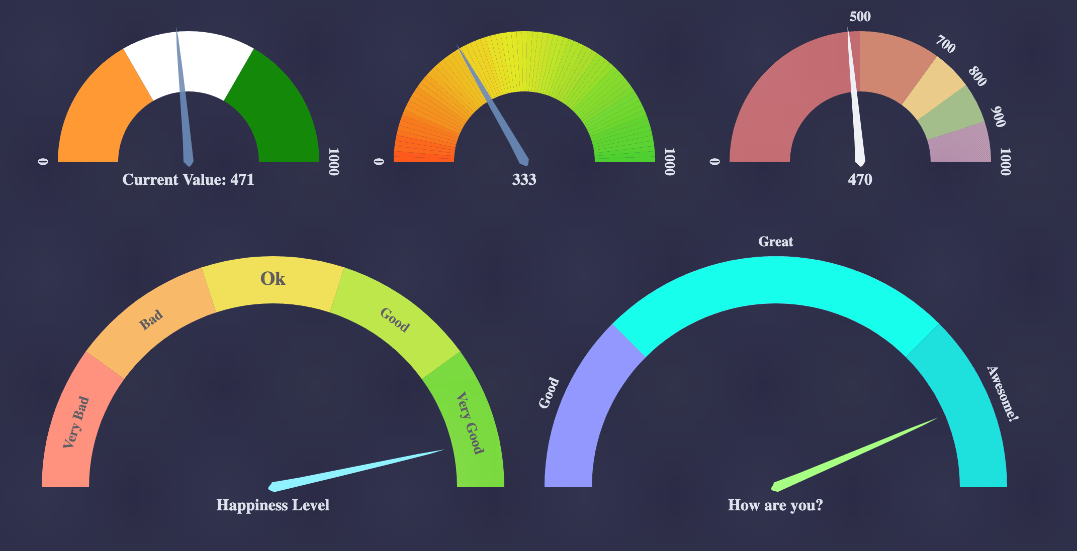
| currentValueText | String | ${value} | Should be provided a string which should have ${value} placeholder which will be replaced with current value. By default, current value is shown (formatted with valueFormat). For example, if current Value is 333 if you would like to show Current Value: 333, you should provide a string Current Value: ${value}. See Live Example |
| currentValuePlaceholderStyle | String | ${value} | Should be provided a placeholder string which will be replaced with current value in currentValueTextProp. For example: you can use ruby like interpolation by giving following props - <vue-speedometer currentValueText="Current Value: #{value}" currentValuePlaceholderStyle={"#{value}"} />. This is also helpful if you face no-template-curly-in-string eslint warnings and would like to use different placeholder for current value |
| customSegmentStops | Array | [] | Array of values starting at min value, and ending at max value. This configuration is useful if you would like to split the segments at custom points or have unequal segments at preferred values. If the values does not begin and end with min and max value respectively, an error will be thrown. This configuration will override segments prop, since total number of segments will be length - 1 of customSegmentProps. For example, [0, 50, 75, 100] value will have three segments - 0-50, 50-75, 75-100. See Live Example |
| customSegmentLabels | Array<CustomSegmentLabel> |
[] | Takes an array of CustomSegmentLabel objects. Each object has following keys for custom rendering of labels - text, fontSize, color, position: OUTSIDE/INSIDE. For position, there is a helper CustomSegmentLabelPosition Object/Type which you can import like import { CustomSegmentLabelPosition } from 'vue-speedometer', and use it like CustomSegmentLabelPosition.Inside / CustomSegmentLabelPosition.Outside. This works for both JS and Typescript. For type(script) definitions, please refer here. |
| labelFontSize | String | 14px | Font size for segment labels/legends |
| valueTextFontSize | String | 16px | Font size for current value text |
| valueTextFontWeight | String | bold | Font weight for current value text. Any valid font weight identifier (500, bold etc) can be used. |
| paddingHorizontal | Number | 0 | Provides right/left space for the label text. Takes a number (without explicit unit, unit will be taken from dimensionUnit config which defaults to px). Helpful when using a bigger font size for label texts. |
| paddingVertical | Number | 0 | Provides top/bottom space for the current value label text below the needle. Takes a number (without explicit unit, unit will be taken from dimensionUnit config which defaults to px). Helpful when using a bigger font size for label texts. |
| svgAriaLabel | String | Vue Speedometer | SVG aria-label property for Accessibility purposes |
You can view Live Examples here
Default with no config - Live Example
export default {
  components: { VueSpeedometer },
  template: `<vue-speedometer />`,
}
With configurations - Live Example
export default {
  components: { VueSpeedometer },
  template: `<vue-speedometer value="333" />`,
}
Custom Segment Labels - Live Example
// 'customSegmentLabels' prop takes an array of 'CustomSegmentLabel' Object
/*
type CustomSegmentLabel = {
  text?: string
  position?: OUTSIDE/INSIDE
  fontSize?: string
  color?: string
}
*/

export default {
  components: { VueSpeedometer },
  template: `
    <div>
      <vue-speedometer
      :width="500"
      :needleHeightRatio="0.7"
      :value="777"
      currentValueText="Happiness Level"
      :customSegmentLabels='[
        {
          text: "Very Bad",
          position: "INSIDE",
          color: "#555",
        },
        {
          text: "Bad",
          position: "INSIDE",
          color: "#555",
        },
        {
          text: "Ok",
          position: "INSIDE",
          color: "#555",
          fontSize: "19px",
        },
        {
          text: "Good",
          position: "INSIDE",
          color: "#555",
        },
        {
          text: "Very Good",
          position: "INSIDE",
          color: "#555",
        },
      ]'
      :ringWidth="47"
      :needleTransitionDuration="3333"
      needleTransition="easeElastic"
      needleColor="#a7ff83"
      textColor="#d8dee9"
    />
    </div>
  `,
}

/>
Custom Segment Colors - Live Example
export default {
  components: { VueSpeedometer },
  template: `
    <div>
      <vue-speedometer
        :maxSegmentLabels="12"
        :segments="3"
        :value="470"
        :segmentColors='["tomato", "gold", "limegreen"]'
        needleColor="lightgreen"
      />
    </div>
    `,
}
  // startColor will be ignored
  // endColor will be ignored
/>
Custom Segment Stops - Live Example
  export default {
    components: { VueSpeedometer },
    template: `
      <div>
        <vue-speedometer
          :needleHeightRatio="0.7"
          :maxSegmentLabels="5"
          :segments="3"
          :customSegmentStops="[0, 500, 750, 900, 1000]"
          :segmentColors='["firebrick", "tomato", "gold", "limegreen"]'
          :value="333"
        />
      </div>
    `,
  }
  // `segments` prop will be ignored since it will be calculated from `customSegmentStops`
  // In this case there will be `4` segments (0-500, 500-750, 750-900, 900-1000)
/>
Fluid Width Example - Live Example
// Speedometer will take the width of the parent div (500)
// any width passed will be ignored
export default {
  components: { VueSpeedometer },
  data() {
    return {
      styles: {
        width: "500px",
        height: "300px",
        background: "#EFEFEF",
      },
    }
  },
  template: `
    <div :style="styles">
      <vue-speedometer
        :fluidWidth="true"
        :minValue="100"
        :maxValue="500"
        :value="473"
        needleColor="steelblue"
      />
      <div>
      Fluid width takes the width of the parent div (<strong>500px</strong> in this case)
      </div>
    </div>
  `,
}
Needle Transition Example - Live Example
export default {
  components: { VueSpeedometer },
  template: `
  <div>
    <vue-speedometer
      :value="333"
      needleColor="steelblue"
      :needleTransitionDuration="4000"
      needleTransition="easeElastic"
    />
  </div>
  `,
}
Force Render component on props change - Live Example
// By default, when props change, only the value prop is updated and animated.
// This is to maintain smooth visualization and to ignore breaking appearance changes like segments, colors etc.
// You can override this behaviour by giving forceRender: true

export default {
  components: { VueSpeedometer },
  template: `
  <div>
    <vue-speedometer
      :value="333"
      :forceRender="true"
      needleColor="steelblue"
      :needleTransitionDuration="4000"
      needleTransition="easeElastic"
    />
  </div>
  `,
}
Needle Height Configuration Example - Live Example
export default {
  components: { VueSpeedometer },
  template: `
    <div>
      <vue-speedometer
        :value="333"
        :needleHeightRatio="0.5"
      />
    </div>
`,
}
You can give a value between 0 and 1 to control the needle height.
Gradient Like Effect - Live Example
export default {
  components: { VueSpeedometer },
  template: `
    <div>
      <vue-speedometer
        :needleHeightRatio="0.7"
        :maxSegmentLabels="5"
        :segments="1000"
        :value="333"
      />
    </div>
  `,
}- Test coverage (with vue-test-utils)
- Convert entire code base to ES6
- Split core from lifecycles
- Typescript support
vue-speedometer comes with a test suite using vue-test-utils.
// navigate to root folder and run
npm test
// or 'yarn test' if you are using yarn- Please refer this comment if you run into
vue cli you are using the runtime only build of vue where the template compiler is not availablemessage when running from your local setup bootstrapped withvue-cli. Basically create avue.config.js
// vue.config.js
module.exports = {
  runtimeCompiler: true
}- React: react-d3-speedometer
- Svelte: svelte-speedometer
vue-speedometer shares its core with react-d3-speedometer. For more info and context, please visit react-d3-speedometer
![@dependabot[bot]](https://avatars.githubusercontent.com/in/29110?s=64&v=4)